"Lens" focuses on visual accessibility standards, and allows designers to test their sketch mockups before being sent to a developer. "Lens" does this by showing the designer how their product will look to different people with various vision conditions.
Project Details
Timeline: 1 week Sprint
Deliverables: Invision Prototype, Sketch Plugin Mockup
Tools: Sketch, Illustrator, Invision
Target Market: The underrepresented, visually impaired demographic = 10% of the world.
Role: User Research • Ideation/Sketching • Information Architecture • Wireframing • Usability Testing • Iteration • Prototyping
Team Members: Candice Cloutier, Johnny Farr, Przemek Jalowski
Business Objectives
Add accessibility to the businesses workflow, which allows them to market it as an offering to their clients.
The app should offer a way for businesses to make their products more accessible, allowing them to reach more users, and distinguish themselves from other apps, hopefully gaining a larger market share.
User Objectives
Provide a way to improve user accessibility within the digital landscape, and reduce the digital divide.
The app should offer the user a way to add accessibility to their lives in a useful and productive way.
My Role
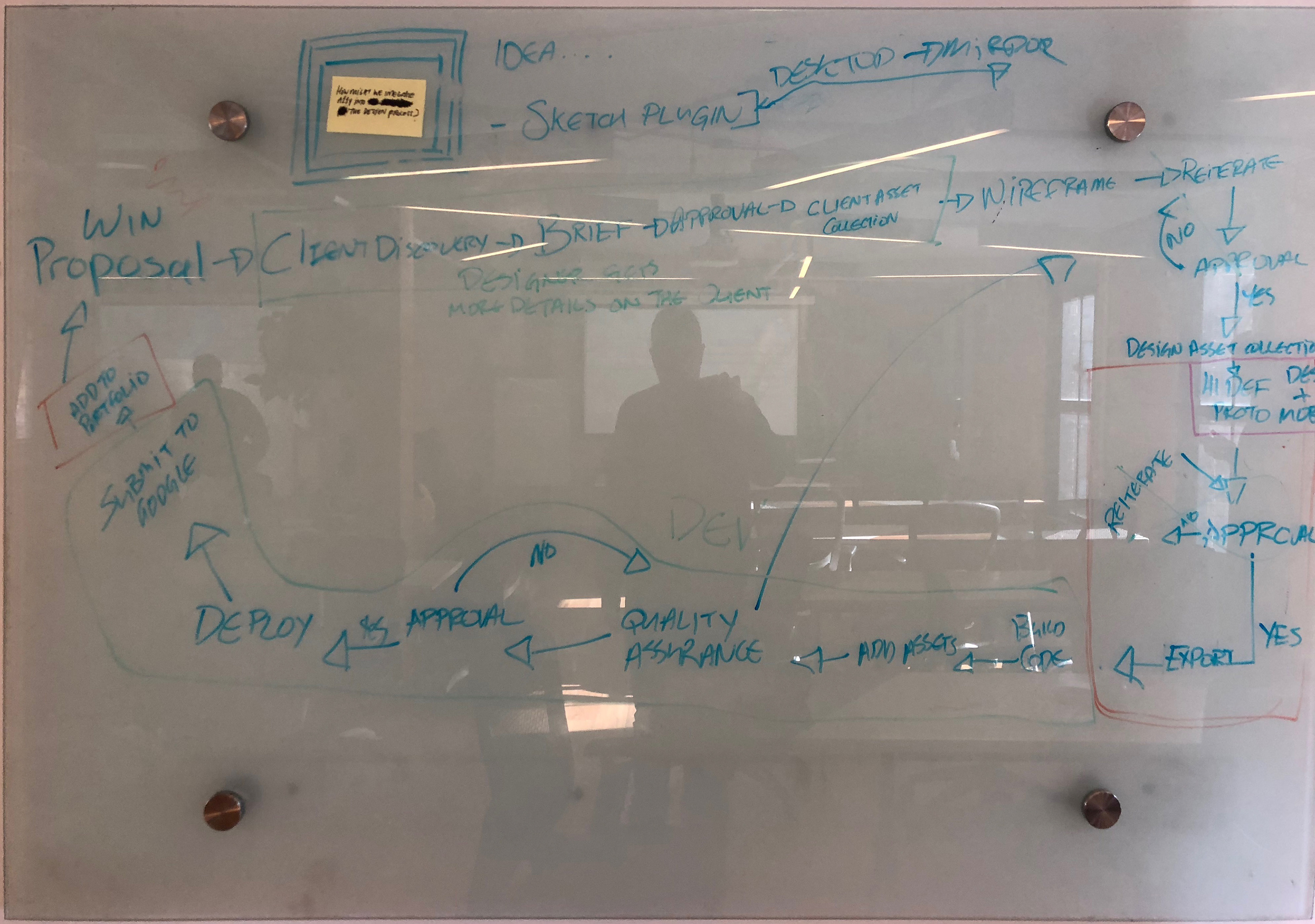
As a team the group ran through the steps of a sprint; research, interviews, ideation, journey maps, sketching, and finally prototype and testing. On the fourth day, it was time to create a prototype and roles were divided between all the group members. The roles were: writing the content, sketching, asset collection, wireframes, high fidelity mockup, and invision prototype. I was in charge of the high fidelity mockup, and stitching together the invision prototype.
The Problem
The digital divide, described as the gap in demographics based on computer literacy, access to modern technology and internet, and difficulties within the digital landscape based on impairments. For this sprint my group and I decided to focus on the topic of accessibility issues amongst those with visual impairments.
10% of the global population has some form of visual impairment, which limits them in properly accessing the vast digital landscape.
The 3 Big Myths
According to Connected Labs, when it comes to accessible design, there are 3 myths most companies cite for not following accessibility standards within their product.
1. Accessibility adds significant time and cost to a project
2. Accessibility only helps a small fraction of the population.
3. There is no business case for accessibility.
(https://medium.com/connected-lab/three-myths-of-accessible-product-development-98f30fa45aa1)
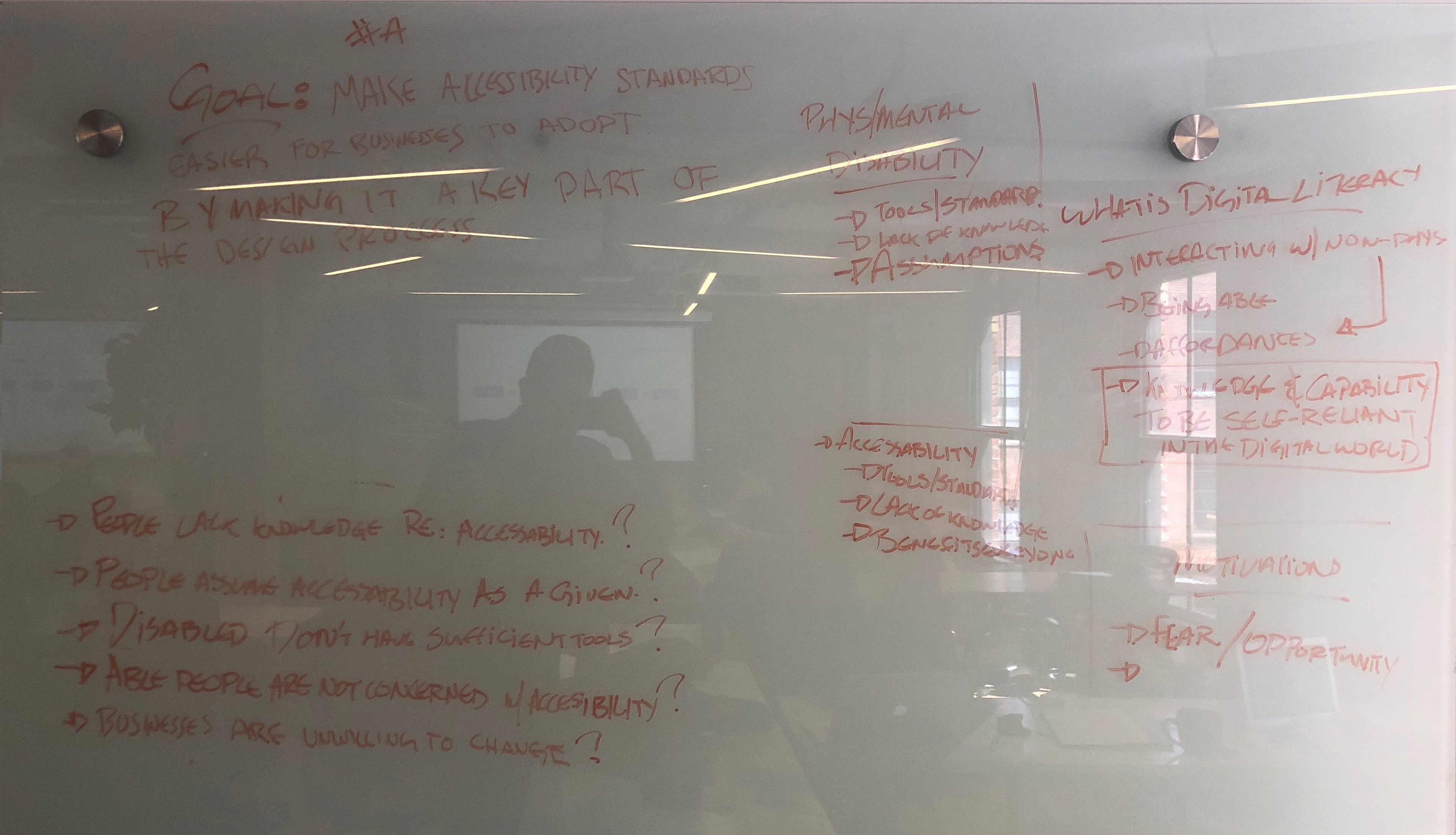
Goals, Assumptions and Leading Statements
"An inclusive design solution is one that is integrated into mainstream design, making the solution more affordable and more usable for all."
(https://guide.inclusivedesign.ca/insights/IntegratedSolutions.html)
(https://guide.inclusivedesign.ca/insights/IntegratedSolutions.html)
Research Insights
When speaking with fellow designers, I found that a large portion of them were aware of the existence of accessible design, but rarely did they personally add it to their work flow. In their respective companies it was not seen as a business imperative.
Secondly, people could not relate, and did not fully understand the full scope of the issue. If they could not see it through their own eyes, they could only guess, and not truly empathize.
These findings were inline with the online and market research the team completed.
How Might We integrate accessibility standards earlier into the design process?
Ideate
We need to provide an easy way for designers to view their designs in real time and adjust them to be more inclusive for the visually impaired.
JOURNEY MAP
Following the research and interview stage, as a group we mapped out 3 user journeys. The three journeys revolved around a designer, a senior citizen and a young professional with colour blindness. This allowed the group to find overlap and opportunities amongst the various journeys, and pick one journey which we would base our app around. We chose to focus on the designer.
Following the research and interview stage, as a group we mapped out 3 user journeys. The three journeys revolved around a designer, a senior citizen and a young professional with colour blindness. This allowed the group to find overlap and opportunities amongst the various journeys, and pick one journey which we would base our app around. We chose to focus on the designer.

User Journeys - Designer, Colour Blind Young Adult, Senior
User Journey - Designer - where will "Lens" fit into their workflow
We are designing for the designer and UX expert on every team. We want to provide an easy way for them to add accessibility to their workflow, and to convince their bosses of the business imperative of accessible design.
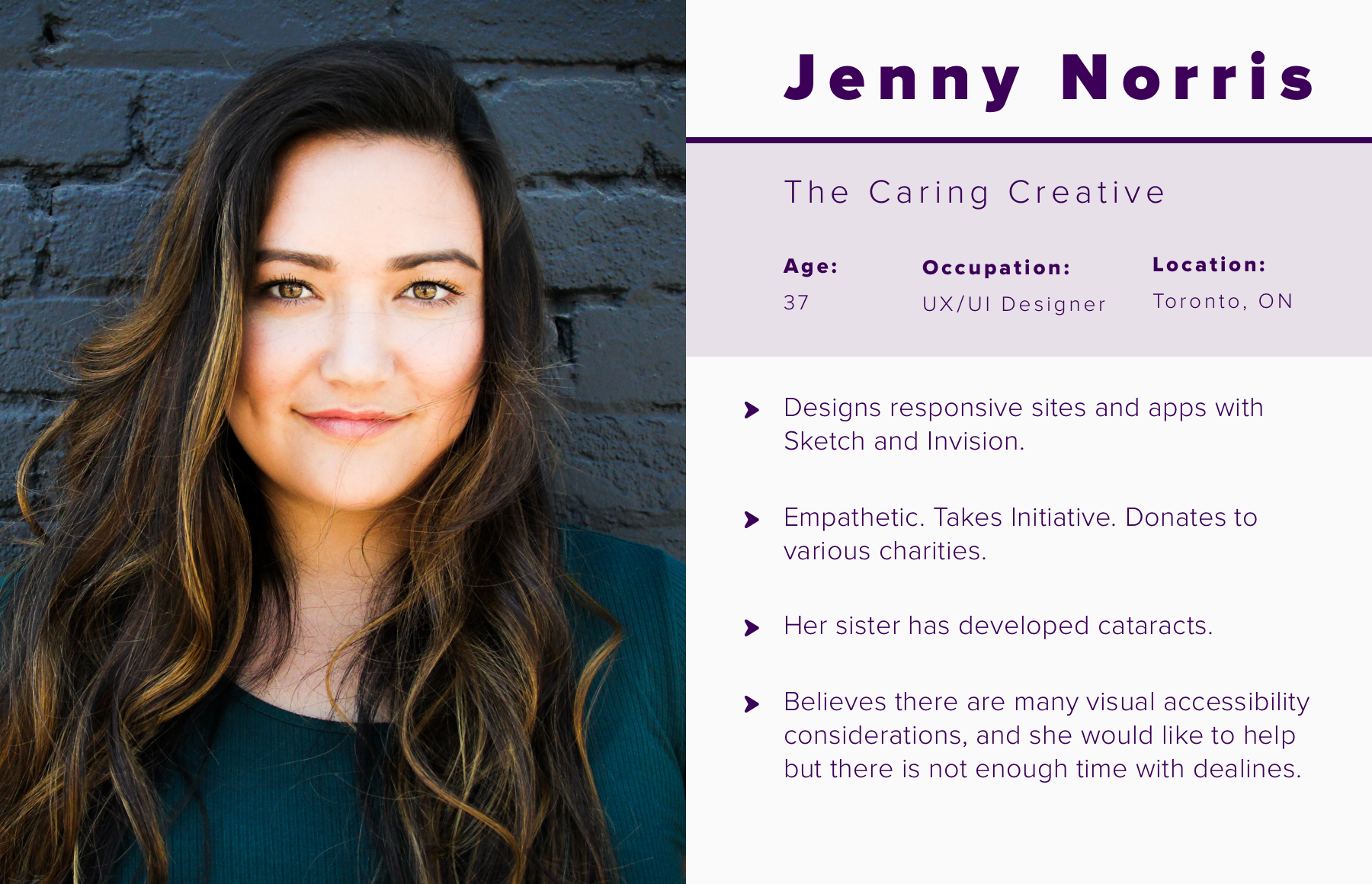
User Persona - A designer in the field with an emotional attachment to the topic, due to a relative with cataracts.
SKETCHING & VOTING
To narrow down our ideas and pick the best ones to move forward with, the group ran a set of card sorting, crazy 8’s, and an “art gallery”, displaying our best ideas and consolidating them into a series of features and layouts we felt would best meet the needs of the user.
To narrow down our ideas and pick the best ones to move forward with, the group ran a set of card sorting, crazy 8’s, and an “art gallery”, displaying our best ideas and consolidating them into a series of features and layouts we felt would best meet the needs of the user.
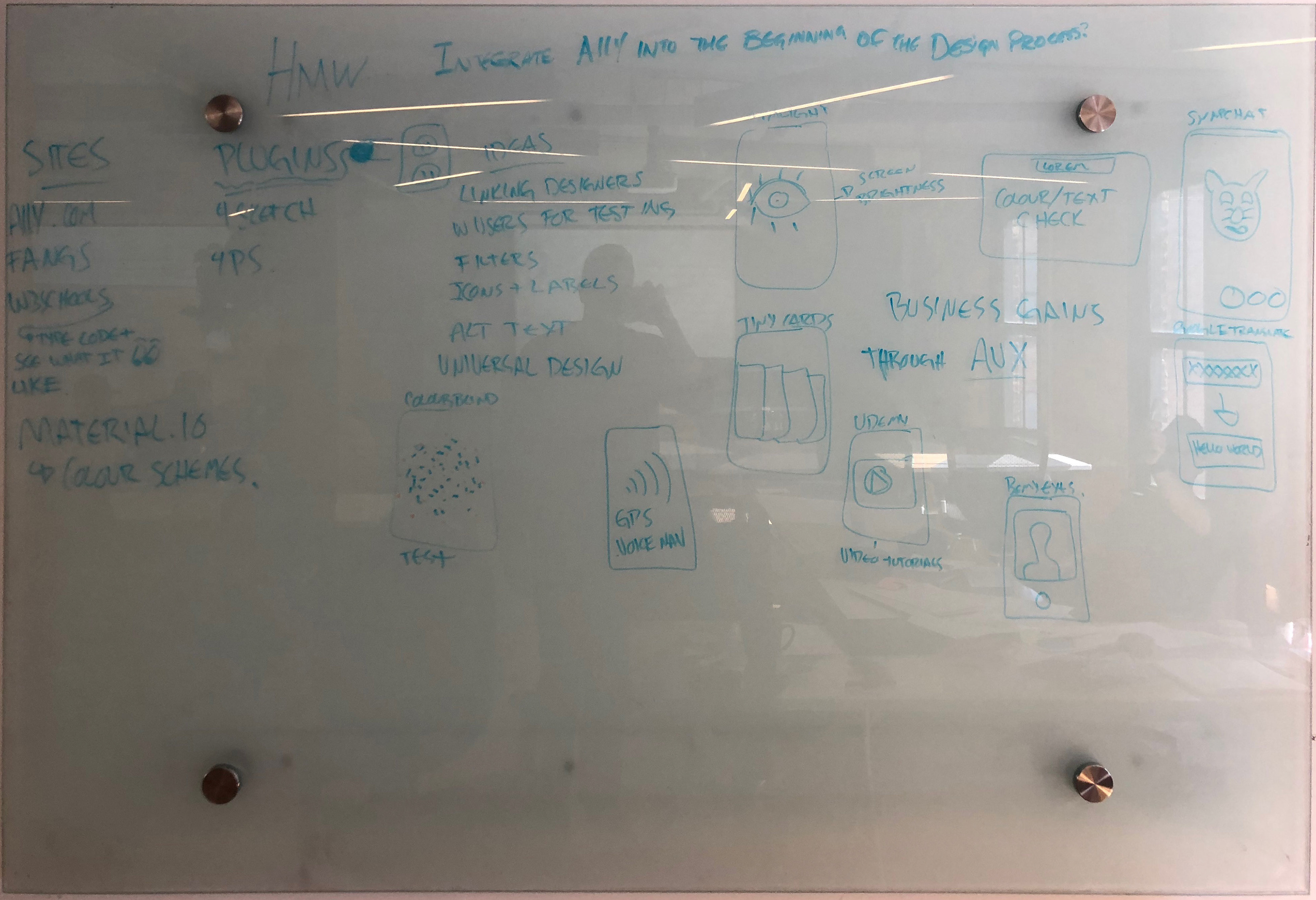
Inspiration and layouts whiteboard session
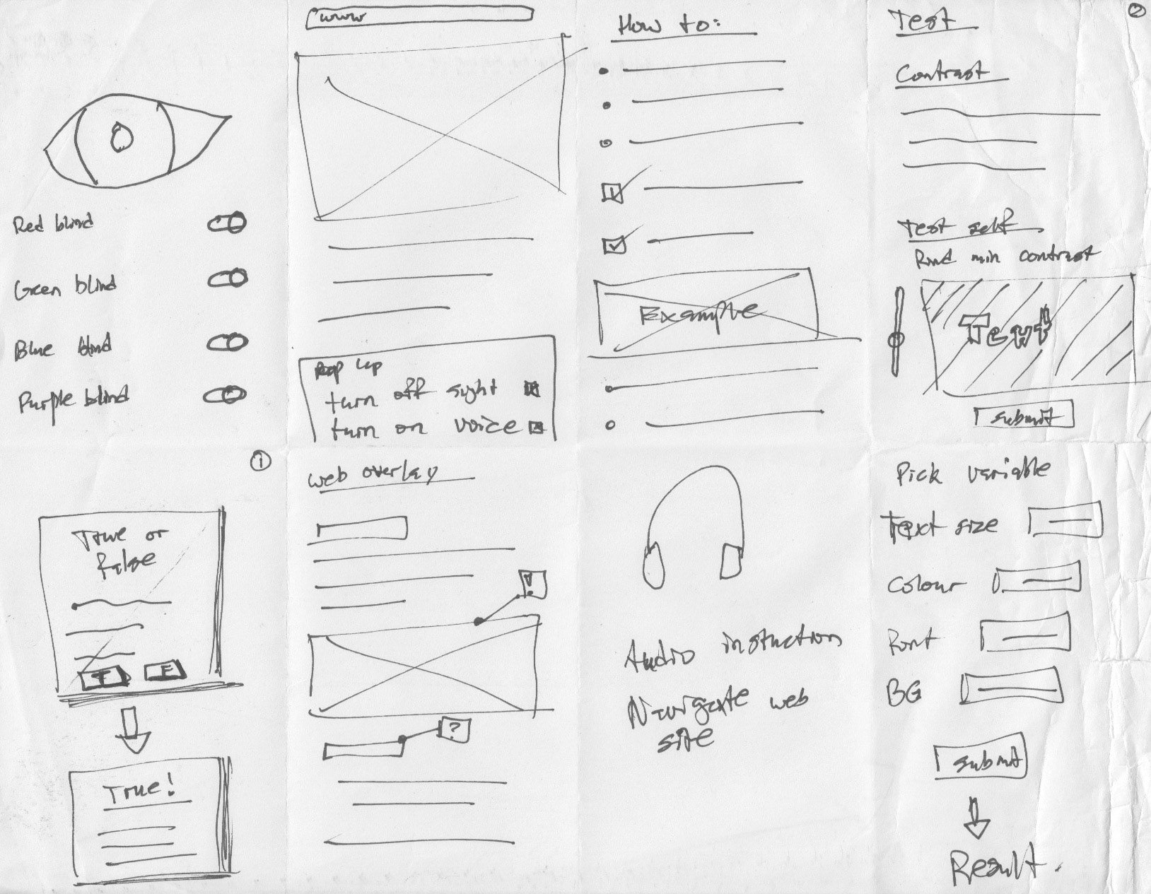
Sprint - Crazy 8's - Focused on screen based around educating the user and changing settings within the app (toggles, sliders)
Following the completion of the first wireframes, user tests were run to find the pain points users had with the current app, and to find opportunities for improvement. Below are some key insights.
"There needs to be some indicator of what is being toggled"
"The app should suggest how to improve the art work"
"How do you switch to another screen?"
"Is the purpose of the app to educate or fix the design?"
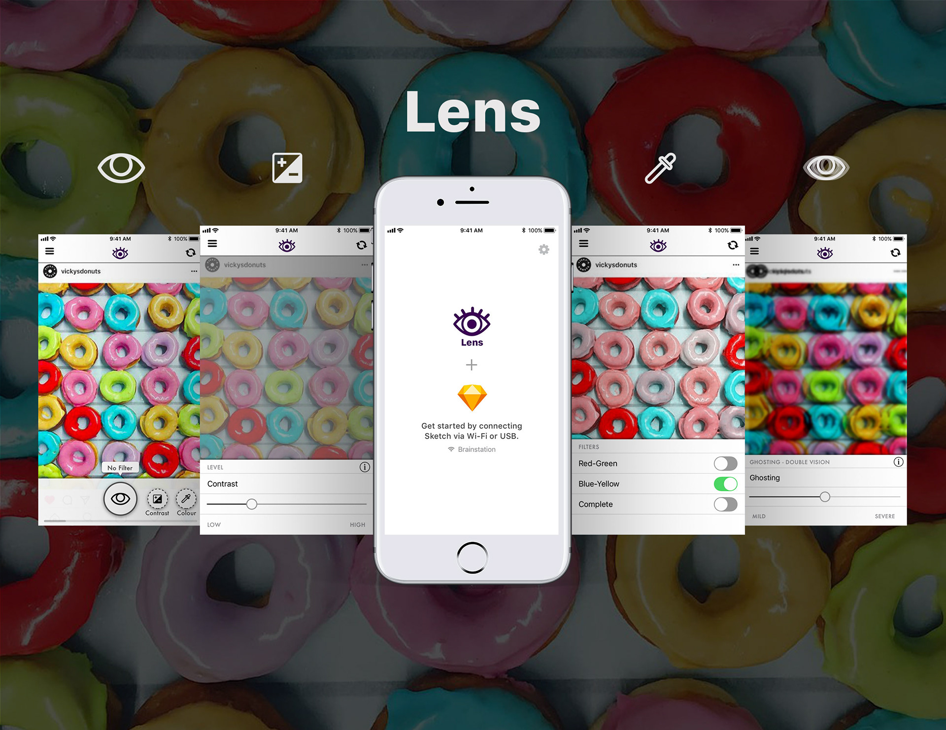
HIGH FIDELITY MOCKUP AND FLOW
After running user tests, we proceeded to high fidelity mockups. This is the final mockup and flow of the app.
After running user tests, we proceeded to high fidelity mockups. This is the final mockup and flow of the app.

Prototype
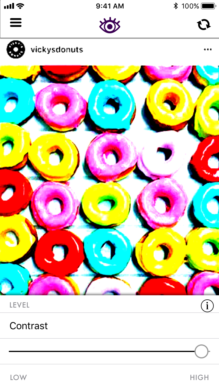
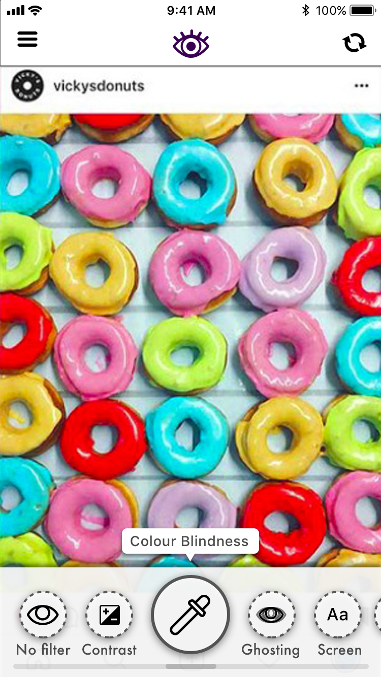
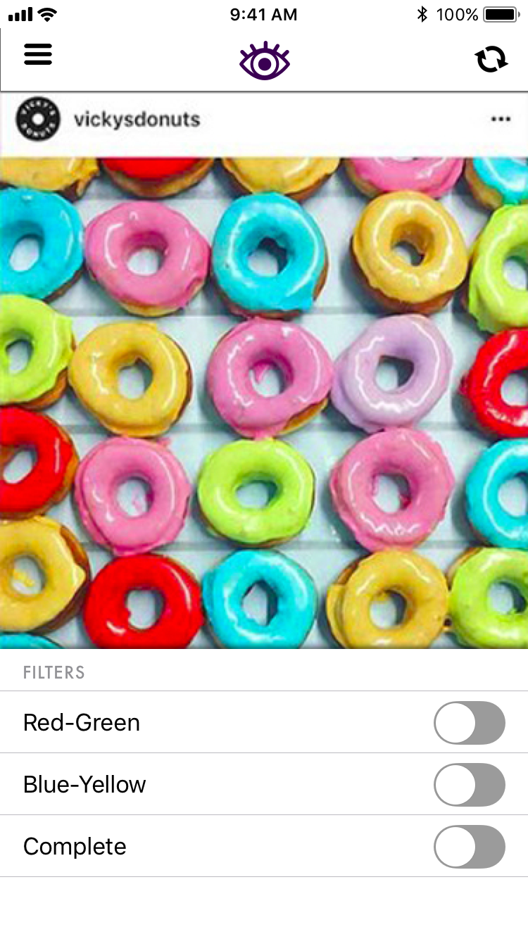
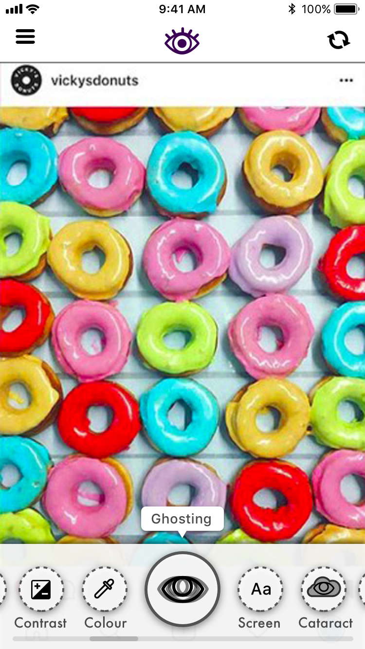
Our prototype consists of two elements, a sketch plugin, and an app which links to sketch similar to "Mirror".
LENS - SKETCH PLUGIN
With this sketch plugin a designer can view, toggle, adjust, and test their designs before sending them to development. The plugin allows anything on the screen to be tested, this includes mobile, desktop layouts and even web pages. The plugin can greatly reduce time and cost associated with the testing process. Less users will need to be tested specifically for visual accessibility, and less revisions will be needed to adjust colours for those same customers.
With this sketch plugin a designer can view, toggle, adjust, and test their designs before sending them to development. The plugin allows anything on the screen to be tested, this includes mobile, desktop layouts and even web pages. The plugin can greatly reduce time and cost associated with the testing process. Less users will need to be tested specifically for visual accessibility, and less revisions will be needed to adjust colours for those same customers.
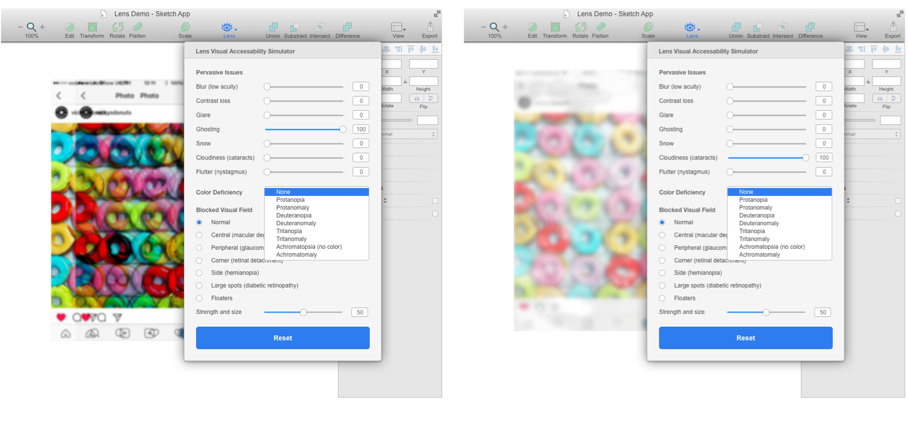
Sketch plugin - Lens - apply visual impairment filters to your designs
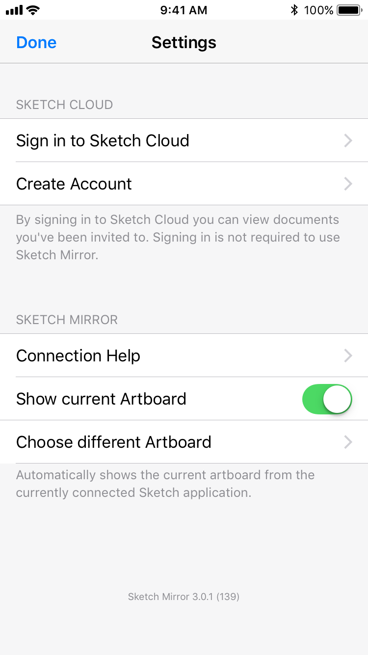
LENS - SKETCH "MIRROR" APP
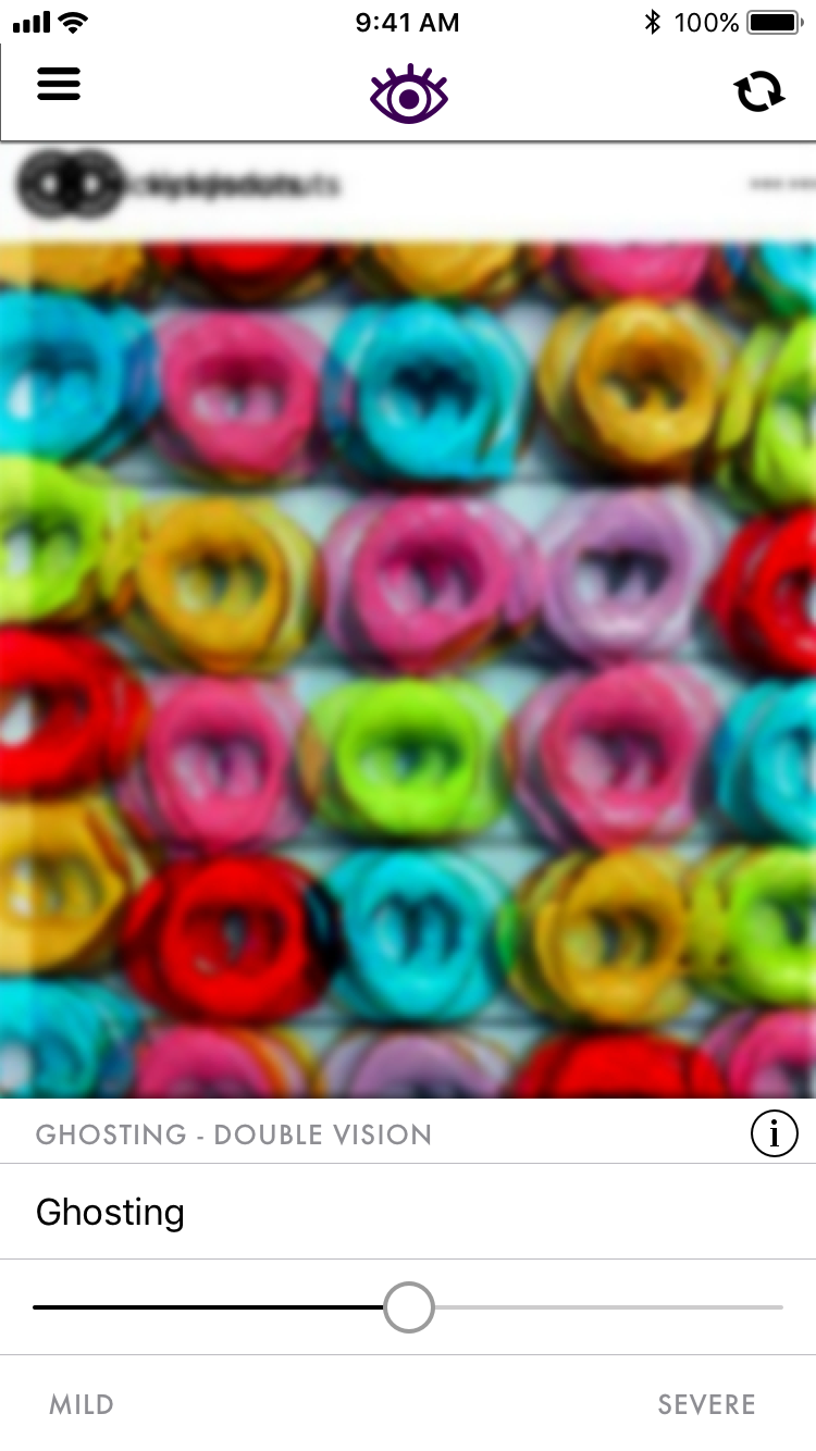
Inspired by sketch mirror and snapchat, the stand alone app syncs with sketch and allows the designer to quickly and easily, swipe, toggle, and adjust their designs in real-time. Unlike the plugin, the app allows the designer to view the mock up in their hand. Conversely, viewing the mockup on a monitor can skew and change how things are interpreted, but holding and interacting with the app allows for the truest representation of how someone with a visual impairment will see the product.
Inspired by sketch mirror and snapchat, the stand alone app syncs with sketch and allows the designer to quickly and easily, swipe, toggle, and adjust their designs in real-time. Unlike the plugin, the app allows the designer to view the mock up in their hand. Conversely, viewing the mockup on a monitor can skew and change how things are interpreted, but holding and interacting with the app allows for the truest representation of how someone with a visual impairment will see the product.
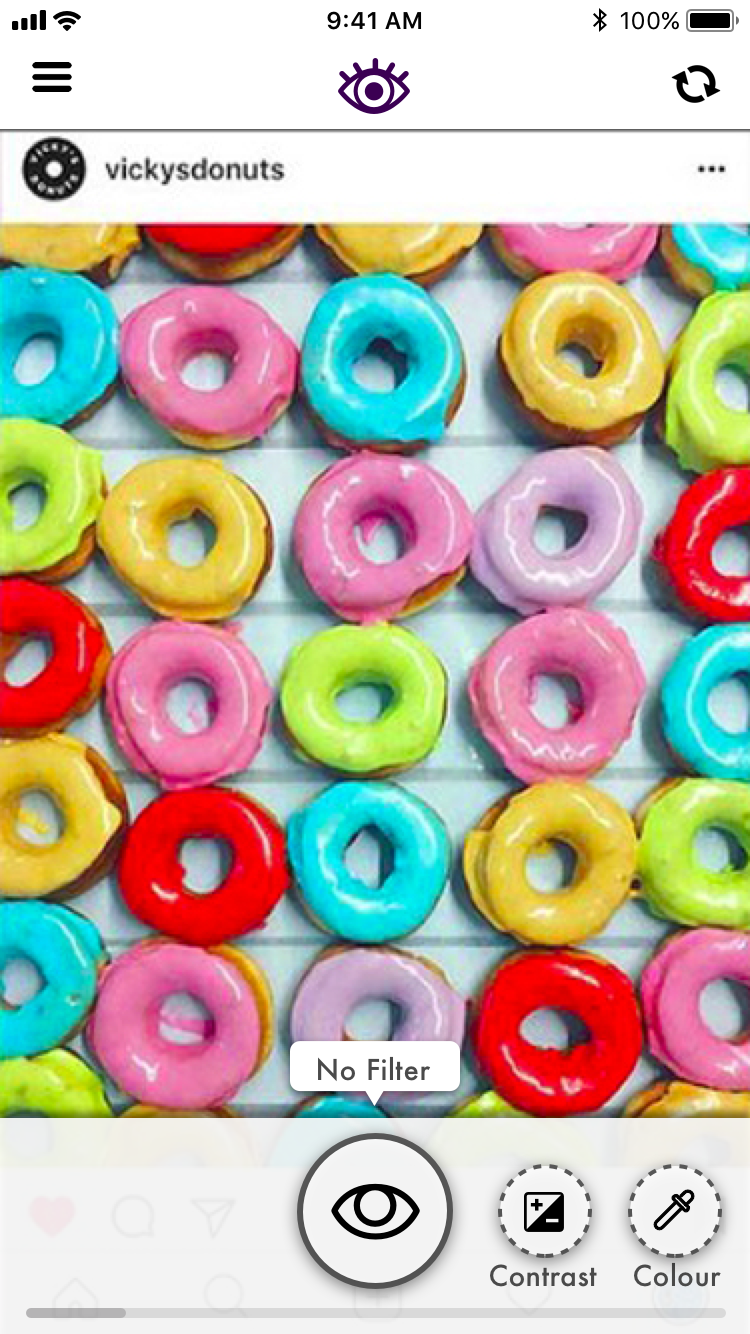
Click through the phone to interact.
TASK FLOW - View the instagram mockup as if you had various visual accessibility challenges
1. Connect - click on the screen to get started
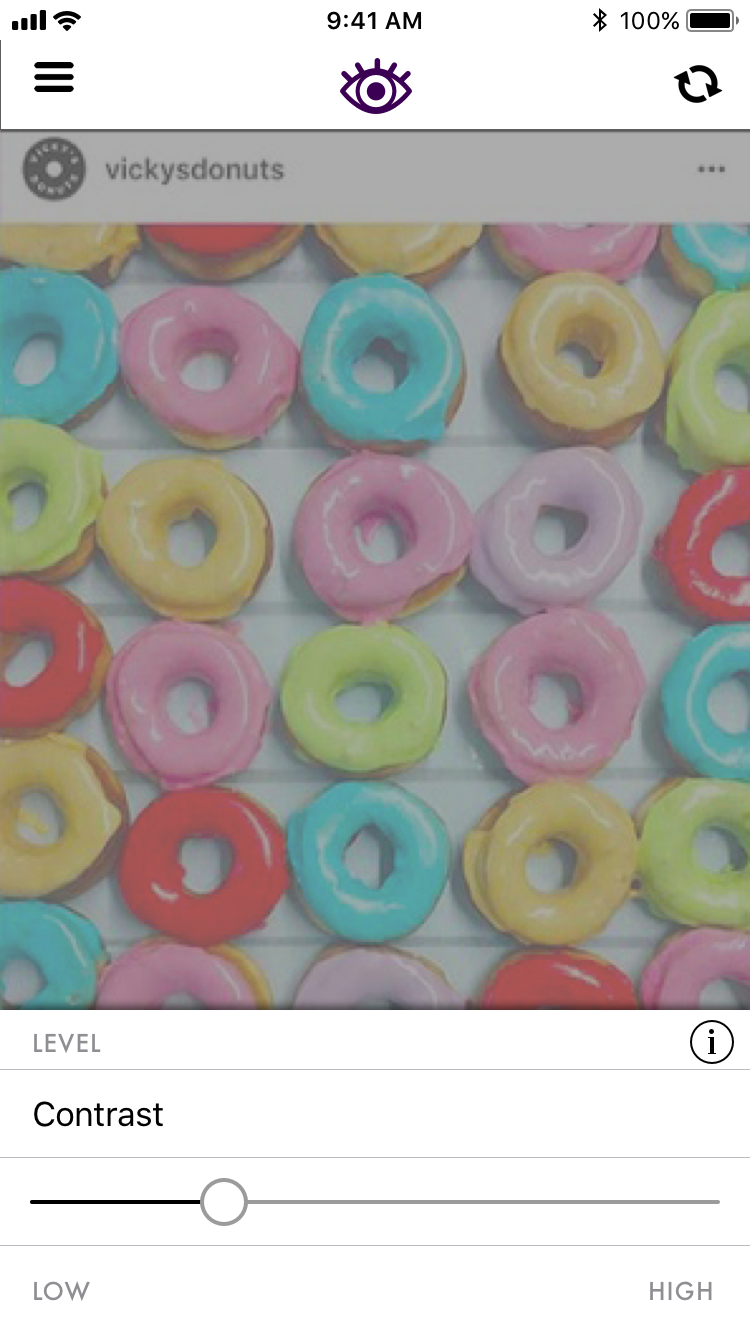
2. Navigate - click through the screens left and right
3. Toggle - toggle the settings
4. Repeat #2 & #3 (x3) - Contrast/Colour Blindness/Ghosting
2. Navigate - click through the screens left and right
3. Toggle - toggle the settings
4. Repeat #2 & #3 (x3) - Contrast/Colour Blindness/Ghosting


Outcome
After running user tests with multiple designers, things were not perfect, users were confused with the navigation, and the filters were not self explanatory.
More descriptions and hints as to what can be adjusted within each screen will be needed.
However, aside from a few usability issues, the tests went well, and the app has potential and a place in the market. People were excited about the concept, and including it in their workflow.
“That’s really cool” - Krishna Lohra
Next Steps
With the project completed, it is time to set the next goals. Firstly, more research will be needed. We will need to speak to a larger user base, specifically more people who are visually impaired. Making an effective tool for designers is important, but if it does not achieve what the visually affected population needs, the app is useless. The app was able to show how people with a visual impairment may see, but it did not offer more information about the condition, or how to best adjust for it. Some useful features to add would be a default setting which shows what most people with the impairment actually see, and at which point any adjustments will have a small ROI. For ease of use, and good UX, the app needs to find a better way to switch between screens and prototypes.
The goal is to reduce the learning curve, and get more buy in.
Icons from https://thenounproject.com/
Photos from https://www.instagram.com/vickysdonuts
Persona photo from Photo by Hannah Nelson from Pexels
Photos from https://www.instagram.com/vickysdonuts
Persona photo from Photo by Hannah Nelson from Pexels