
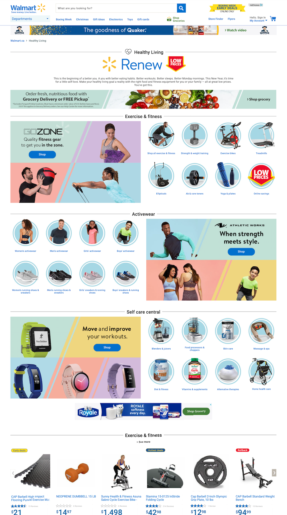
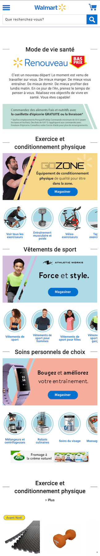
Healthy Living central hub, with banner placements across multiple pages.
Following market research, competitor analysis, banner and tile creation, a new hub was developed.
Project Details
Timeline: 2 weeks
Deliverables: Competitor & Market Research, Brand Tiles, Category Tiles, Custom Banners, L1 Hero Banners, Mini Hero Banners, Run On Site Banners, Header Ad Units
Tools: Photoshop
Project Phases: Competitor & Market Research • Visual Exploration • Banner & Tile Creation • Deployment
Team: Przemek Jalowski, Geoff Rahal, Nicole Rostecki
Business Objectives
Create a central hub for all things healthy living, funneling the customer into a buy-flow quickly.
Helping a customer navigate to a desired category quickly and finding relevant programs reduces the chance of them thinking, “there is nothing good here”, and dropping the service.
User Objectives
Create a central hub making discovery and buying all the things related to healthy living easy.
The page should focus on: easy navigation, fast discovery of items and relevant suggestions for related products.
My Role
Following my market trend research and wireframes, a page layout and title structure was put together in conjunction with the Site Merchant, and Copy Writer on the project. I was then given free rein to create a central hub for Healthy Living and the various tiles and banners placed across the site linking back to the hub.
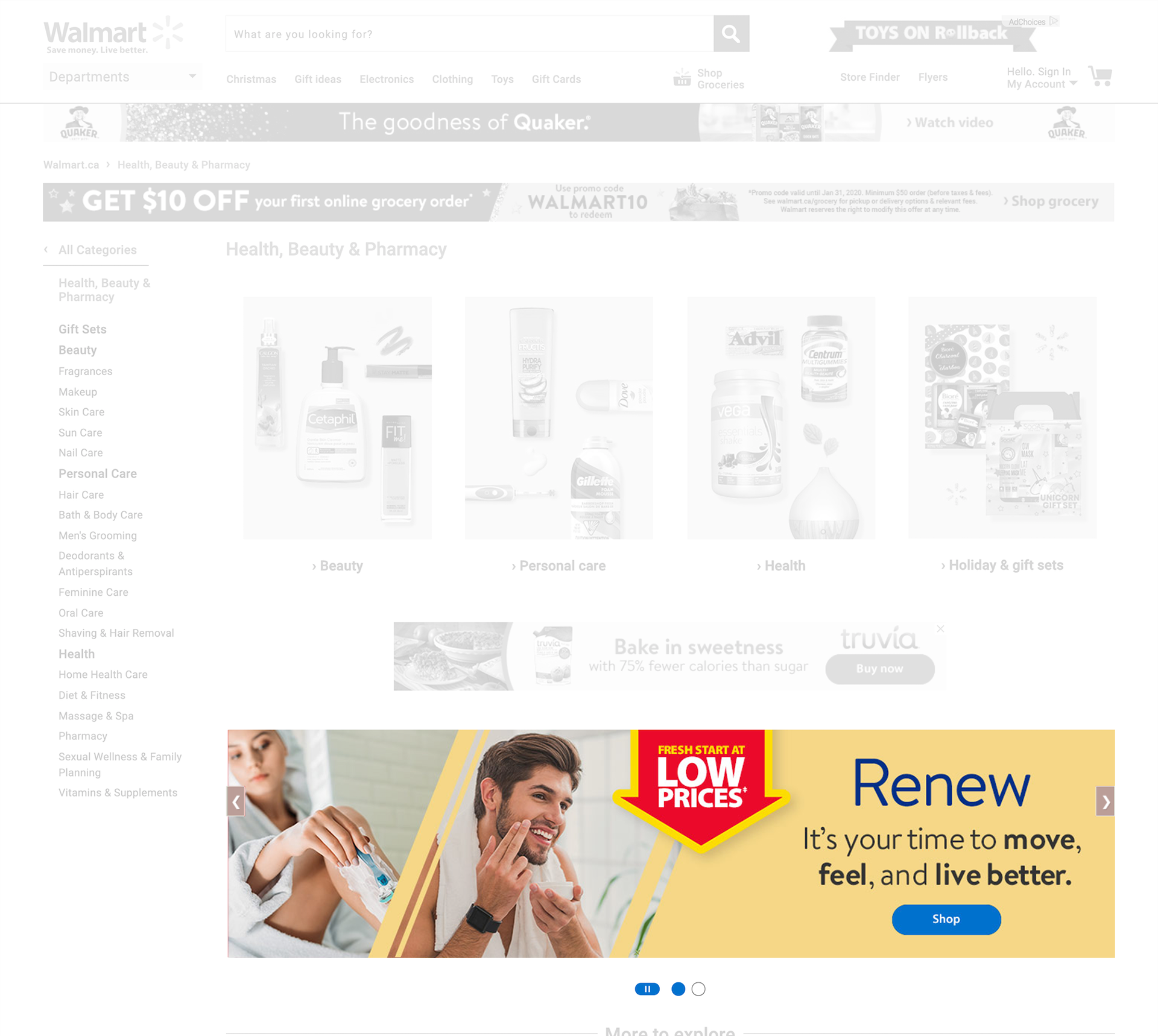
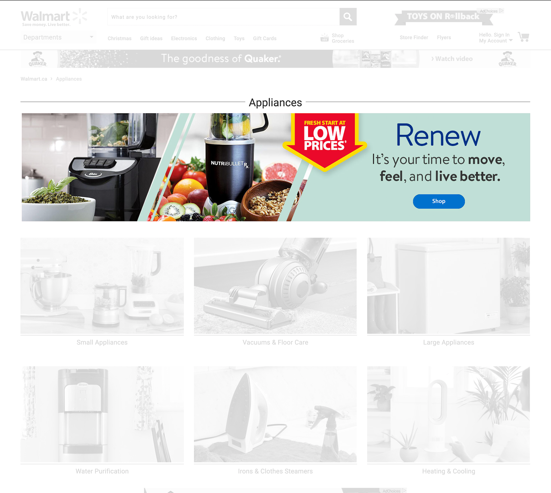
The Problem
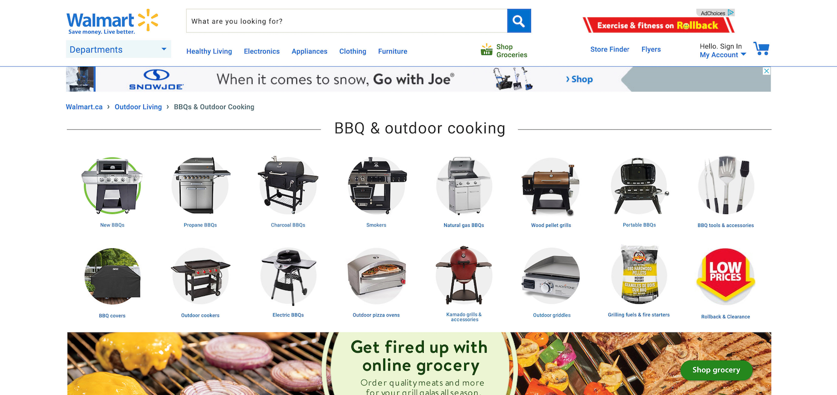
The Healthy Living page had a number of navigational issues, and generally products are scattered all across the website not just belonging to one category.
The goal of the page was to increase clicks and lead users to the exact product they are looking for quicker. Customers did not know what was available, resulting in clicking random categories and having to guess and check.
Discover
RESEARCH
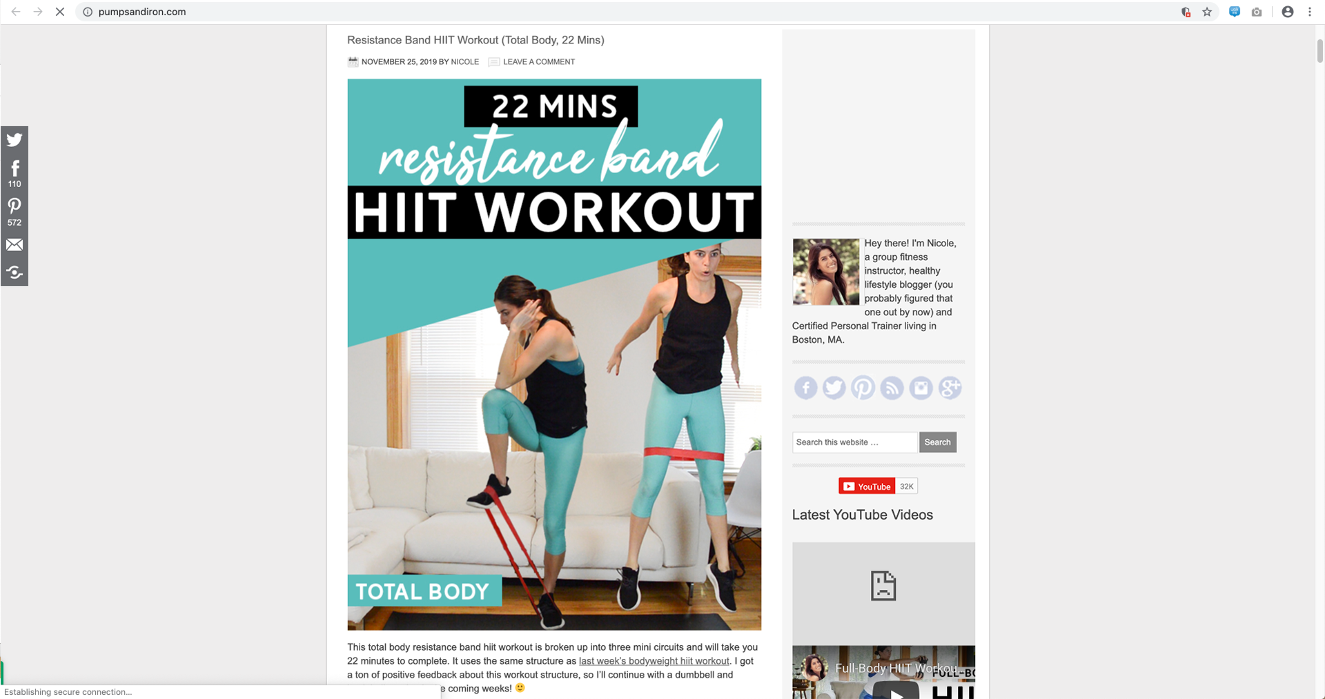
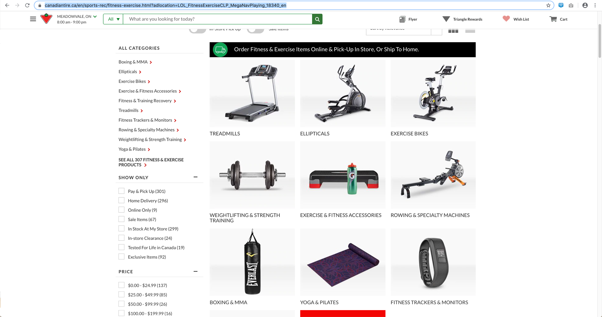
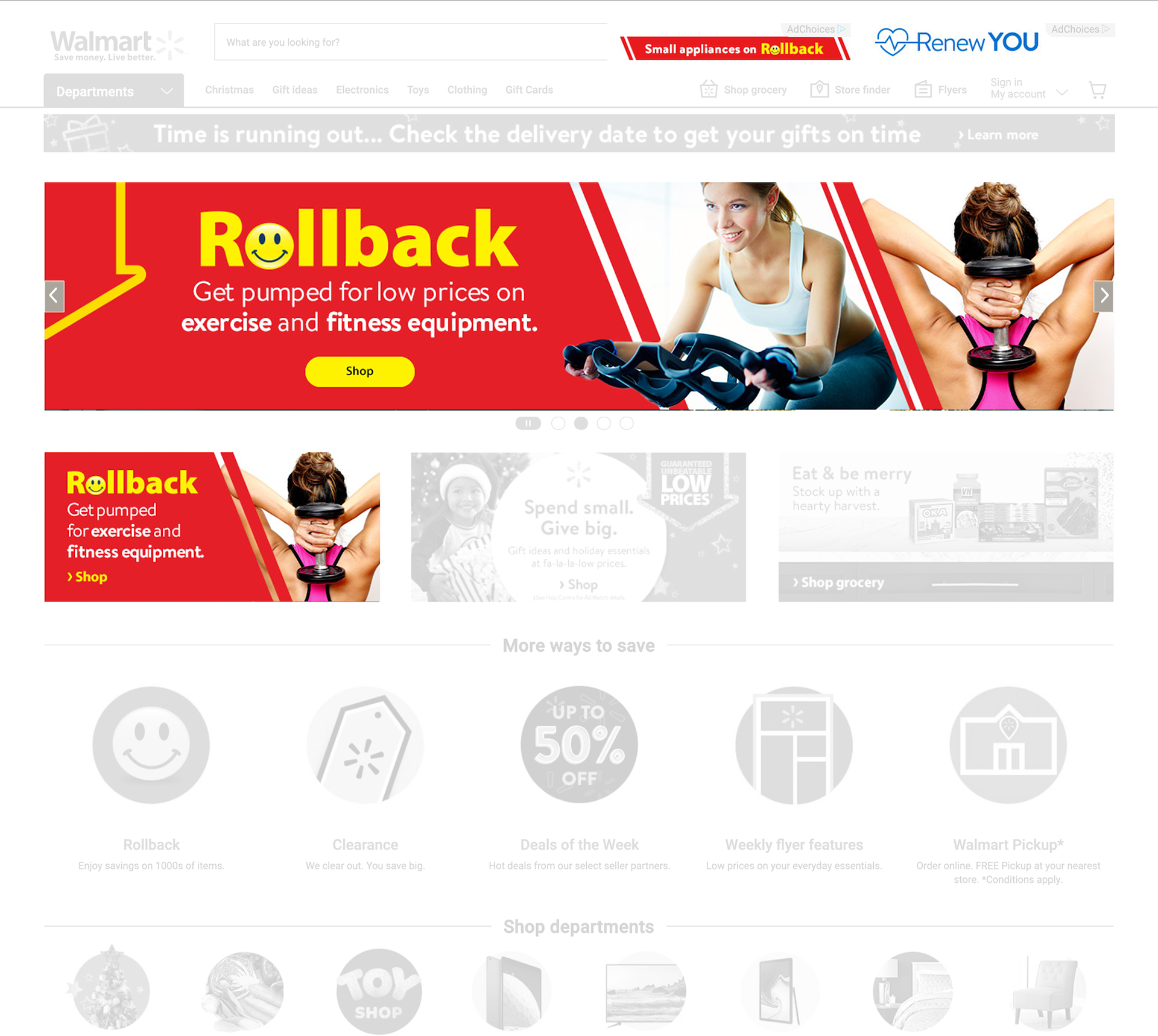
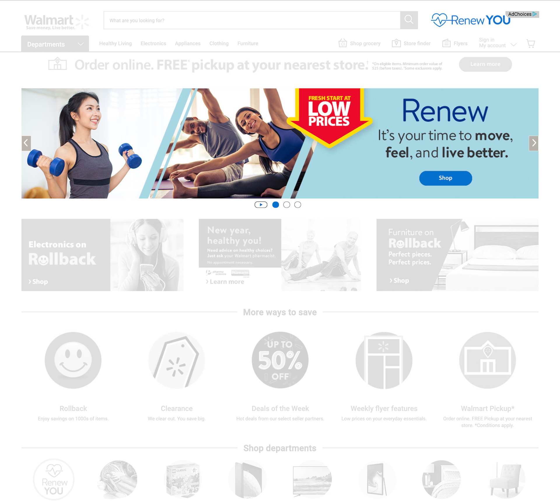
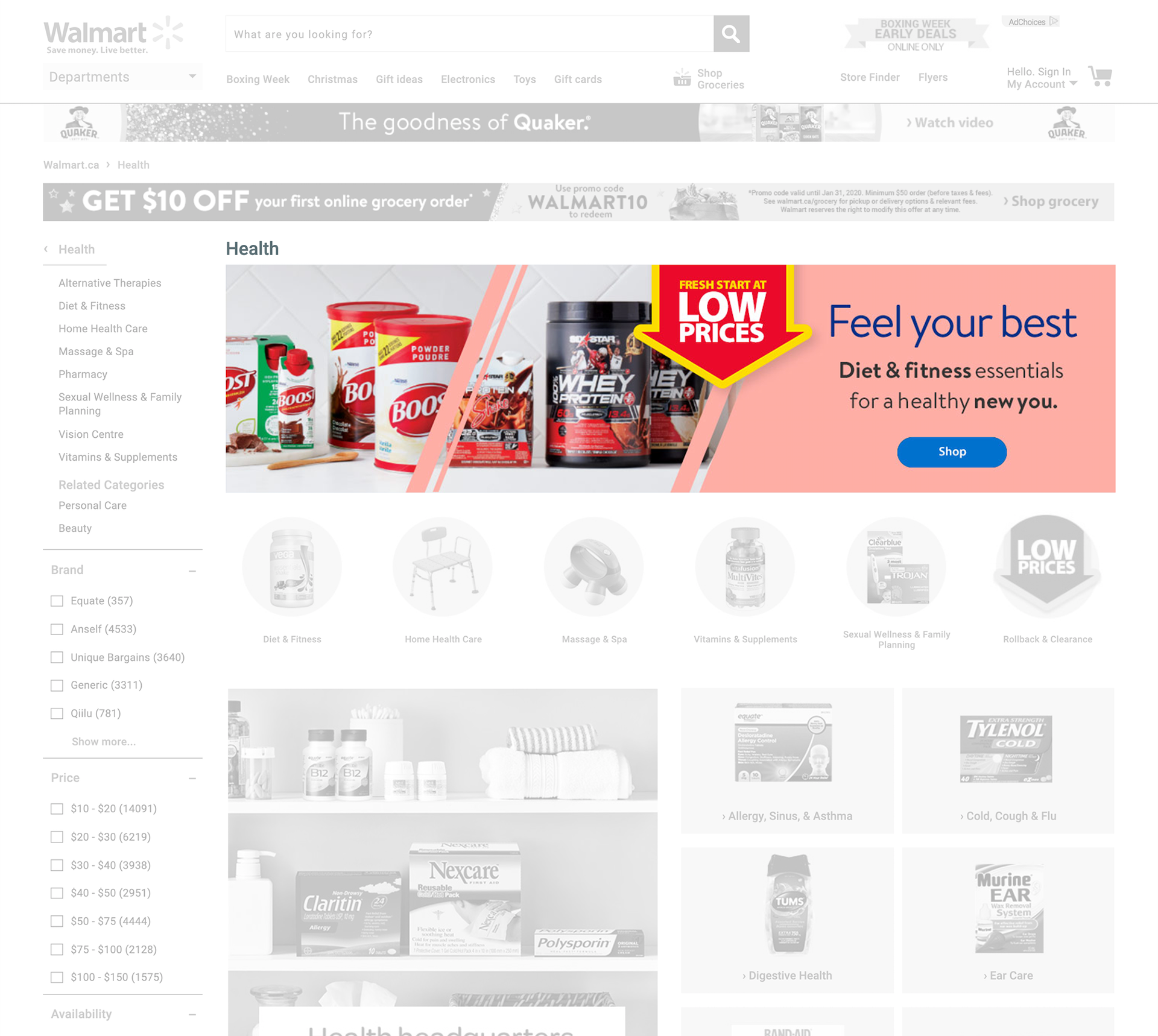
Market and competitor research was conducted to find patterns and get inspiration on layouts that could work for a Healthy Living page. Research encompassed a variety of competitors ranging from: blogs, retail; clothing, electronics, sporting goods, and beauty products.


RECCOMENDATIONS
After analyzing multiple websites, common patterns of both successful and unsuccessful retail pages led to the following considerations:
1 - Show the product you are selling, preferably showcasing any distinguishing features.
2 - Segregate products in a very granular fashion and under universally understood categories.
3 - Create divides in the page, grouping similar categories together.

Ideate
Once the research was complete and a direction was chosen it was time to ideate, come up with concepts and test them out.
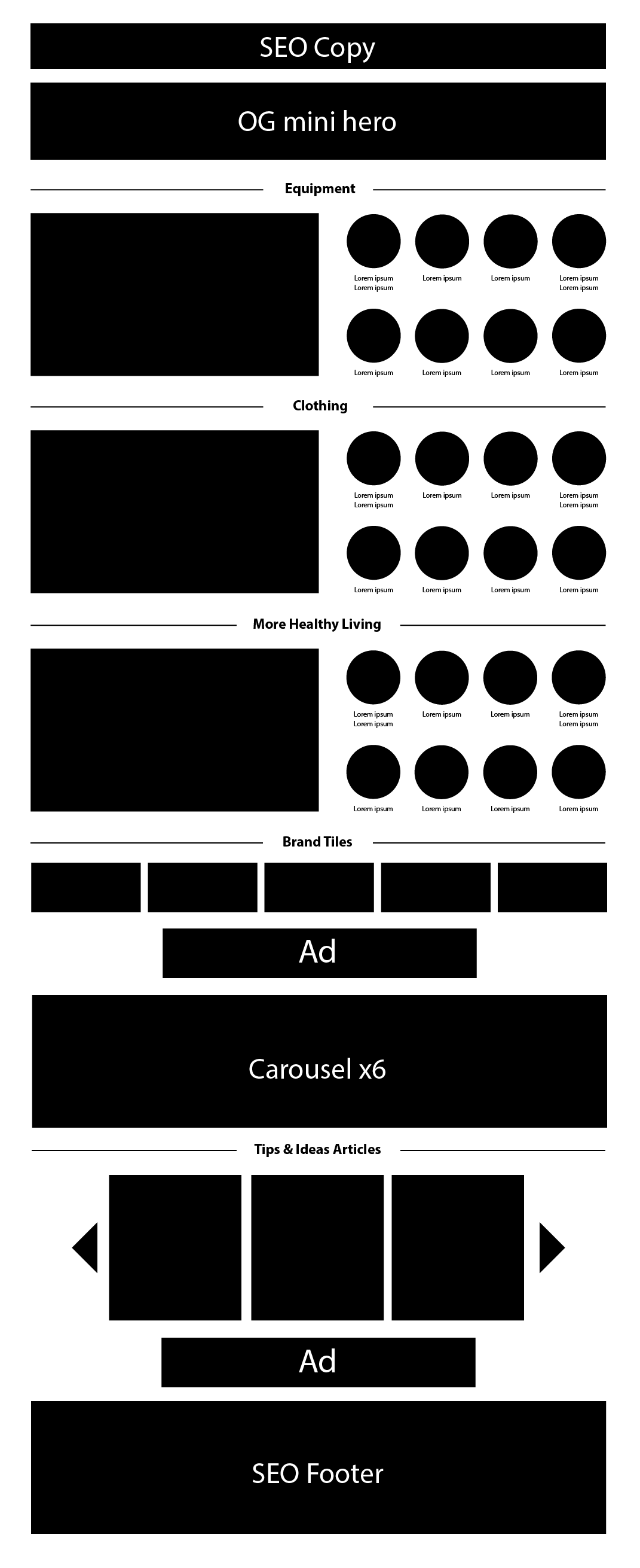
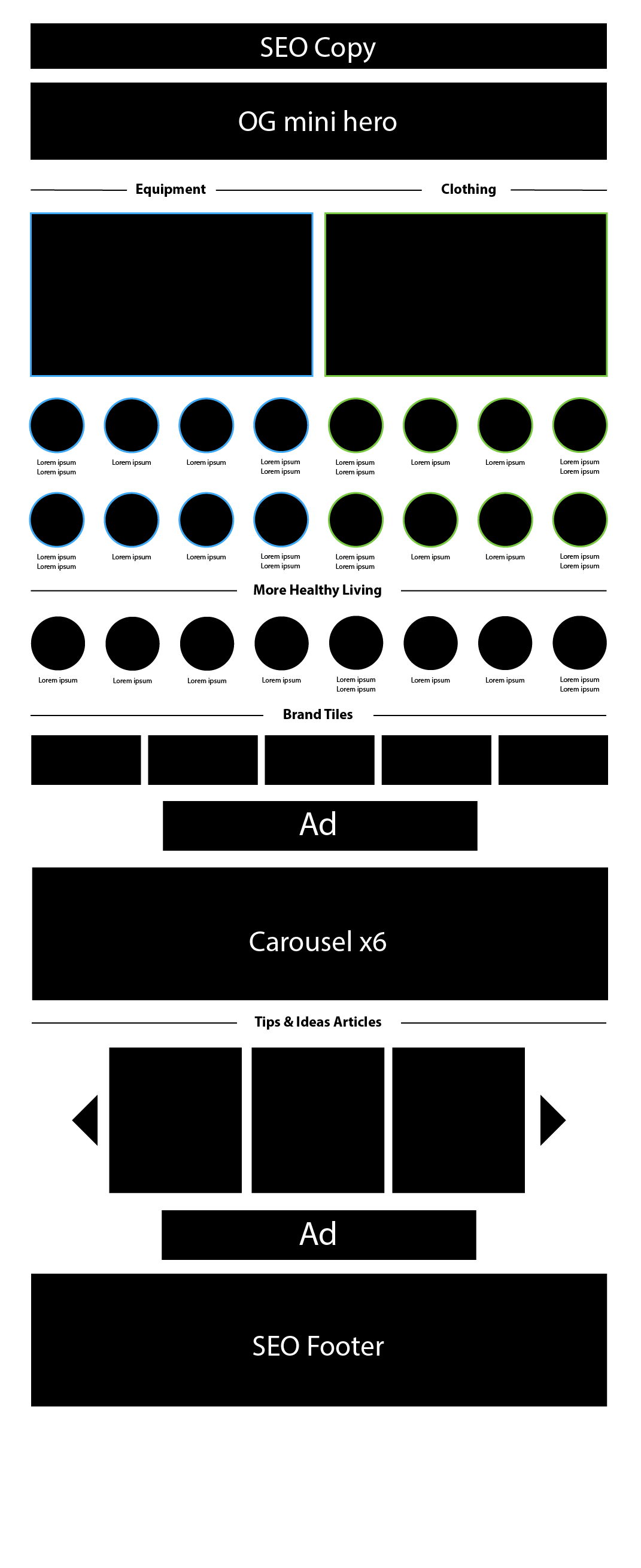
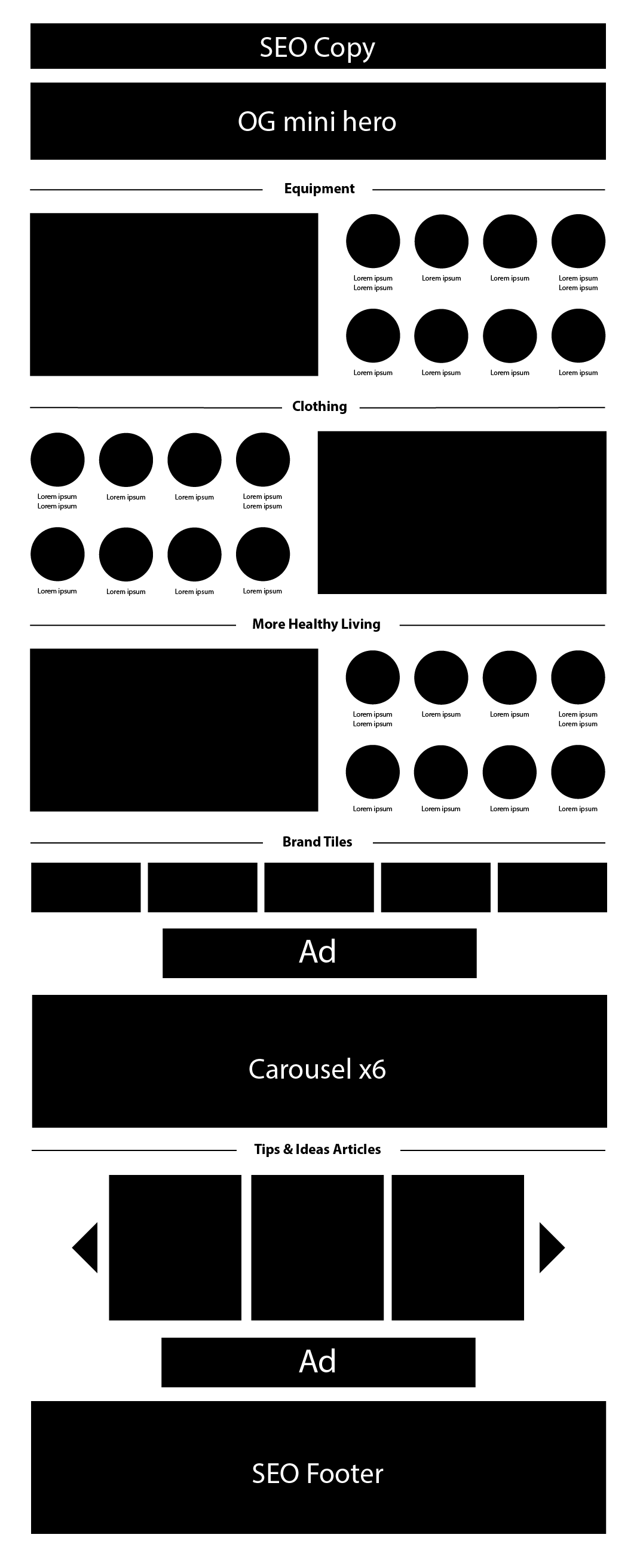
WIREFRAMES
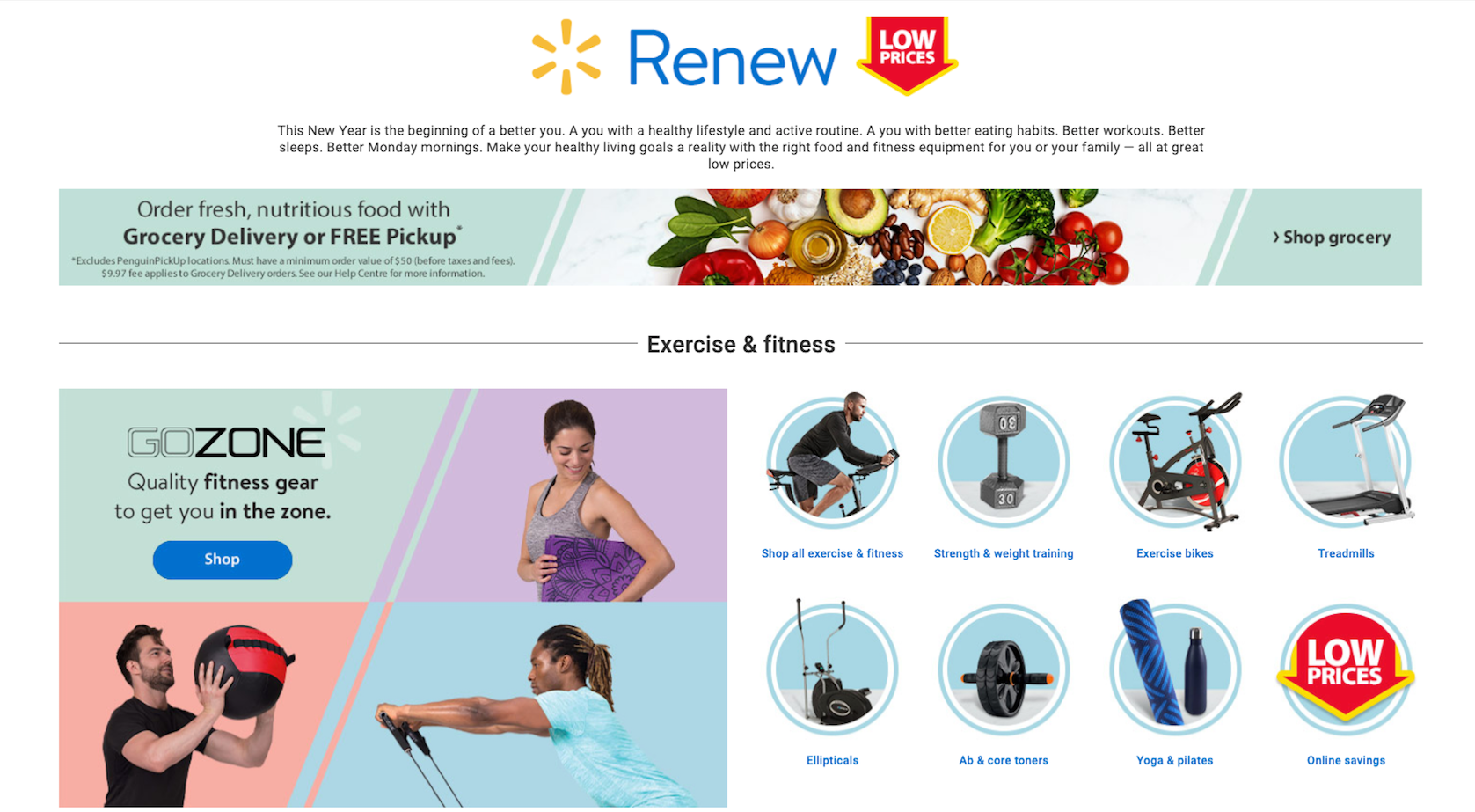
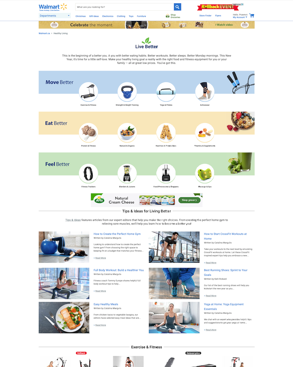
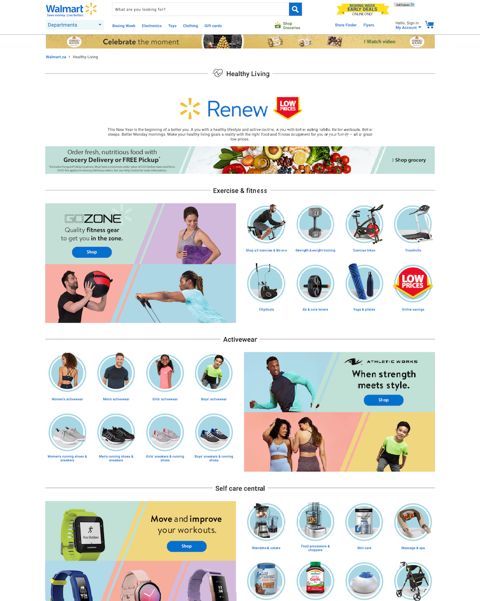
Wireframes were put together to layout and organize the elements on the page, properly grouping similar elements and highlighting the biggest sellers. Larger custom tiles were used to draw the customers' eye and highlight best selling categories, while the remaining tiles were used to direct the customer to specific category pages.
Wireframes were put together to layout and organize the elements on the page, properly grouping similar elements and highlighting the biggest sellers. Larger custom tiles were used to draw the customers' eye and highlight best selling categories, while the remaining tiles were used to direct the customer to specific category pages.
STYLE EXPLORATION
Using the lessons and insights discovered looking at market trends and the considerations outlined from the research, style concepts were put together.
Using the lessons and insights discovered looking at market trends and the considerations outlined from the research, style concepts were put together.
Outcome
After completing the Healthy Living hub, the page is a little longer, but also has twice as many tiles, is more eye-catching and makes it easier to navigate to each sub-page.
All these factors together has led to an increase of clicks, and subsequent purchases.
Next Steps
Following the end of the season, click data will be collected, compared to previous years and used to refine the page for next year. No plans for the page next year have been made yet. The goal of the page continues to be, providing customers with a central hub for all things related to Healthy Living