

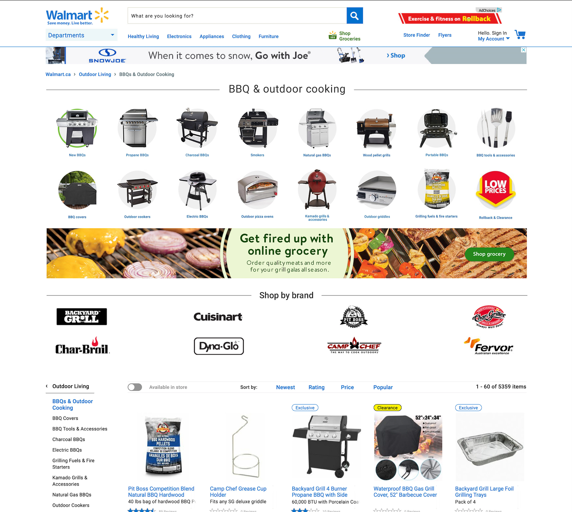
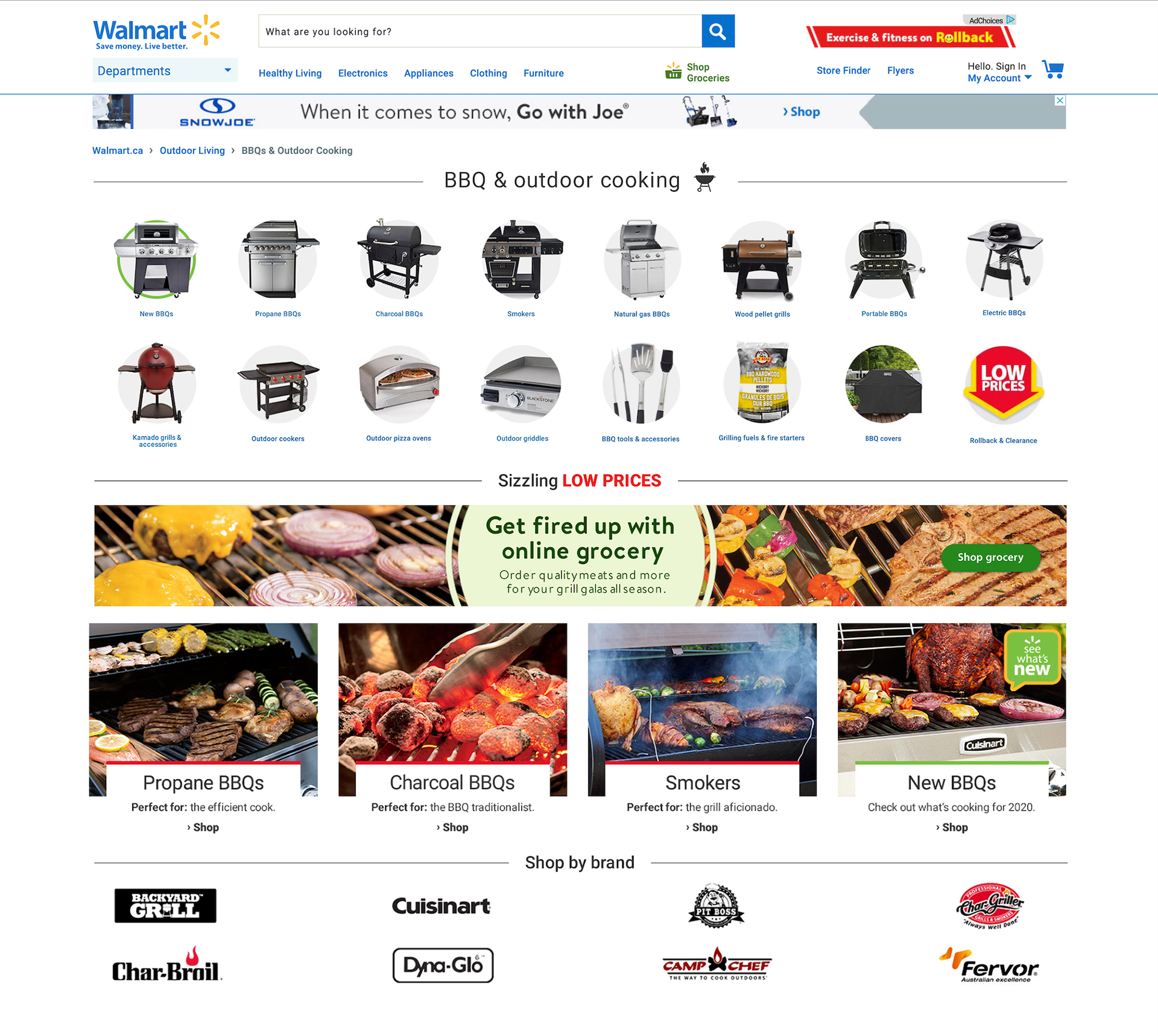
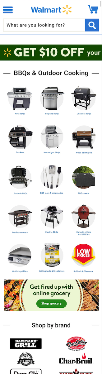
A page dedicated to shopping for and discovering what's new in BBQs.
Following market research, competitor analysis, banner & tile creation and multiple rounds of user interviews, a new BBQ landing page was developed with additional home page assets linking to it.
Project Details
Timeline: 3 weeks
Deliverables: Competitor & Market Research, Category Tiles, Custom Banners, L1 Hero Banners, Mini Hero Banners, Run On Site Banners, Header Ad Units
Tools: Photoshop, Usertesting.com
Project Phases: Competitor & Market Research • Visual Exploration • Banner & Tile Creation • User Interviews • Design Refinement • Deployment
Team: Przemek Jalowski, Nourhan Elazabawy, Nicole Rostecki
Business Objectives
Facilitate an easy and efficient buy-flow for the customer through the use of a central hub.
Helping a customer navigate to a desired product quickly and efficiently by grouping all BBQ items, showcasing best-sellers, related products and suggestions on how to upgrade your current set-up.
User Objectives
Create a central hub making discovery and buying all things related to BBQ easy.
The page should focus on: easy navigation, fast discovery of items and relevant suggestions for related products.
My Role
Following market trend research, assets were put together for both the main BBQ and Walmart home pages. Ten different layouts were explored on the BBQ page. The main goal was to determine if larger custom tiles would work better than a row of category tiles and in which grouping (banners versus tiles, splitting the page with section titles versus banners between rows of tiles) customers respond best to and if that led to more clicks on the page. Once the layouts were narrowed down to a top three, user interviews were conducted on Usertesting.com to gauge customers reactions, opinions and preferences to each of the final layouts. Lastly, final assets were uploaded onto the server and put onto the site.
The Problem
The BBQ page had a number of navigational issues, and generally products are scattered all across the website not belonging to just one category.
The goal of the page was to increase clicks and lead users to the exact product they are looking for quicker. Customers did not know what was available, resulting in clicking random categories and having to guess and check.
Aside from that, there was no big problem, Walmart had more offerings this year and wanted to make the selections more granular, promoting new products while connecting similar pages such as Grocery to BBQ.

Discover
RESEARCH
Market and competitor research was conducted to find patterns and get inspiration on layouts that could work for a BBQ page. Research encompassed a variety of competitors ranging from: Canadian Tire, Lowes, Rona, HomeDepot and Walmart.com.
RECCOMENDATIONS
After analyzing multiple websites, common patterns of both successful and unsuccessful retail pages led to the following considerations:
1 - Show the product you are selling, preferably showcasing any distinguishing features.
2 - Segregate products in a very granular fashion and under universally understood categories.
3 - Create divides in the page, grouping similar categories together.
Ideate
Once the research was complete and a direction was chosen it was time to ideate, come up with concepts and test them with customers.
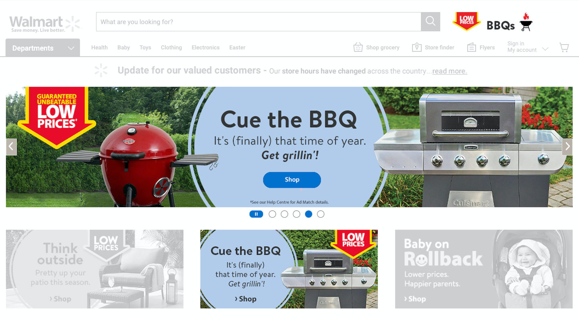
COMPLETING THE TILES & BANNERS
Leveraging existing styles found across the site, tiles and banners were created for the main BBQ page and the home page. Size and layout of the assets was explored for the best results (ex. a row of three custom tiles in a row with category tiles underneath or a 12 column banner with four custom tiles underneath).
Leveraging existing styles found across the site, tiles and banners were created for the main BBQ page and the home page. Size and layout of the assets was explored for the best results (ex. a row of three custom tiles in a row with category tiles underneath or a 12 column banner with four custom tiles underneath).
LAYOUT EXPLORATION
Layouts and wireframes were put together to organize the elements on the page, properly grouping similar elements and highlighting the biggest sellers. Larger custom tiles were used to draw the customers' eye and highlight best selling categories, while the remaining tiles were used to direct the customer to specific category pages.
Layouts and wireframes were put together to organize the elements on the page, properly grouping similar elements and highlighting the biggest sellers. Larger custom tiles were used to draw the customers' eye and highlight best selling categories, while the remaining tiles were used to direct the customer to specific category pages.

Interviews:
Once the tiles were complete and the top three layouts were chosen, I ran a series of tests including A/B tests and User Interviews to get customer opinions, and to discover what elements on the page were clicked the most.
WHAT WE LEARNED
Although the larger images caught the customers eye, if the MAGs (custom tiles) did not relate to what the user is looking for, they were of no importance to the user, and just end up taking space.
Although the larger images caught the customers eye, if the MAGs (custom tiles) did not relate to what the user is looking for, they were of no importance to the user, and just end up taking space.
Recommendations
Instead of simply pulling out a few category tiles and making them bigger, we should use the MAGs for more general categories; New / Classic BBQs / Alternative Cooktops / Accessories.
Instead of simply pulling out a few category tiles and making them bigger, we should use the MAGs for more general categories; New / Classic BBQs / Alternative Cooktops / Accessories.
Outcome
In the end the larger MAG tiles (custom tiles) were not used. The layout consisting of the single Grocery banner, and the circular category tiles was put up on the site. In fact, the category tiles when displayed as the smaller circular tiles were clicked 7% more on Desktop and 47% more on Mobile. The larger MAG tiles did not improve navigation or click rates as they were simply larger versions of the small circular category tiles and did not offer any new functionality.
By refreshing the current page assets, and adding new category tiles, a grocery banner and more brand tiles clicks were increased overall by 10%.

Next Steps
Following the end of the BBQ season, click data will be collected again, compared to previous years and used to refine the page for next year. The current ideas are: category groupings will be refined, the page will be sectioned off based on interests, and the use of large images will be revisited, but only to draw the customers' attention and navigate to further refinements.