
GreenP allows users to park near their favourite venues. The purpose of this heuristic evaluation was to analyze the app and suggest places of improvement.
Project Details
Timeline: 1 week
Deliverables: Heuristic evaluation, app redesign proposal
Tools: Sketch
Target Market: Toronto drivers who park in the city frequently and need an easy way to - Find, Pay, Park.
Project Phases: User/Market Research • Heuristic Evaluation • Information Architecture • Ideation/Sketching
• Hi-Fi Mockup
Team Members: Johnny Farr, Przemek Jalowski, Marc Richler
Business Objectives
Increase the user base for the app, and maintain a high number of returning customers.
The app should aim to reduce the drop off of customers parking at 3rd party sites. Often times the 3rd party lot is cheaper. The app will need to offer a different value proposition.
User Objectives
Make the process of booking paid parking quick and easy.
The app should be streamlined and intuitive for a fast booking process. The user should always know where they are in the app and what is expected of them to complete the process.
My Role
As a team, each member of the group alternated between all the roles. We first began by familiarizing ourselves with all the various heuristics, and going through each app screen in sequence assigning heuristics to each one. Once we analyzed them all, patterns began to form and we narrowed down our scope to 5 key heuristics. We assigned ratings to the screens based on each heuristic. After solutions were discussed, wireframes were created and converted into high fidelity mockups based on the current apps visual identity. The final step was a report outlining all our findings and proposed changes.
Heuristic Evaluation
The task flow was assessed 5 separate times, each time being viewed through a different heuristic lens. Each assessment was given a performance rating solely based on heuristics. These performance ratings were then applied to determine a final general usability rating out of 25 (5 points for each of the chosen heuristics).
List of Heuristics Evaluated in Usability Assessment:
1. Aesthetic & Minimalist Design - Dialogues should not contain information which is irrelevant or rarely needed.
2. Visibility of System Status - The system should always keep users informed about what is going on, through appropriate feedback within a reasonable time.
3. Match Between System and the Real World - The system should speak the users' language, with words, phrases and concepts familiar to the user, rather than system-oriented terms.
4. Consistency and Standards - Users should not have to wonder whether different words, situations, or actions mean the same thing. Follow platform conventions.
5. Recognition Rather than Recall - Minimize the user's memory load by making objects, actions, and options visible.
(https://www.usability.gov/how-to-and-tools/methods/heuristic-evaluation.html)
(https://www.usability.gov/how-to-and-tools/methods/heuristic-evaluation.html)
Design Considerations
1. Style - Could not deviate from the colours, fonts, or layout included in the original app as to remain on brand.
2. Non-Functional Requirements - Must provide availability of information, appearance, reliability, speed/program feedback, usability, visibility, security.
3. Functional Requirements - Specify business needs, and maintain all the features of the task at hand.
4. Time and Budget - Given one week for this project, and no budget to hire additional User Experience designers.
5. Legal Compliance - Keep the app as legally compliant as possible while maximizing aesthetics.
6. Usability - Current app is functional, and easily learnable, improvement was on the user friendliness.
7. Integration - The app supplements a physical machine and process. The appearance, flow and connection to the real-world within the app has to be strong.
Designing for the User
Dianne is a 26 year old HR Coordinator who lives in Vaughan and makes $56K a year. As a foodie, she travels downtown every weekend to dine at a new, hip restaurant with her friends. These restaurants are usually in harder-to-reach areas, so Dianne prefers to drive instead of taking transit. Dianne prefers to use Green P as it is the only app in Toronto that allows her to use her phone to pay for a ticket.

User Persona - A foodie with an insatiable hunger for the city and its many restaurants.
Key Findings
1. By reducing the terms and conditions text to a single, succinct line and then including an “Info” icon beside it, the original additional information can be displayed in a pop-up dialogue
2. While we can’t remove the numbers for logistical reasons, if we included the actual location or street names in this section - ex. Exhibition Place (854) - it will assist Dianne in remembering which number is associated with which lot or space.
3. By including an image of the street parking real-world signage in addition to the lot parking signage, Dianne will receive equal levels of assistance wherever she parks in the city.
4. To minimize Dianne’s memory load, a checkout flow will be added to the top.
5. By creating a different alert box with more succinct text, the important information will be notable to Dianne.
Users agree the app is ugly and difficult to use. They get lost in the process and have no easy indication what code associates with what location.
Following an informal survey
Following an informal survey
Prototype
Based on the findings of the heuristic evaluation, solutions were created by taking the insights extracted regarding potential improvements and applying them to new designs via sketching, wireframing, and high fidelity screens.
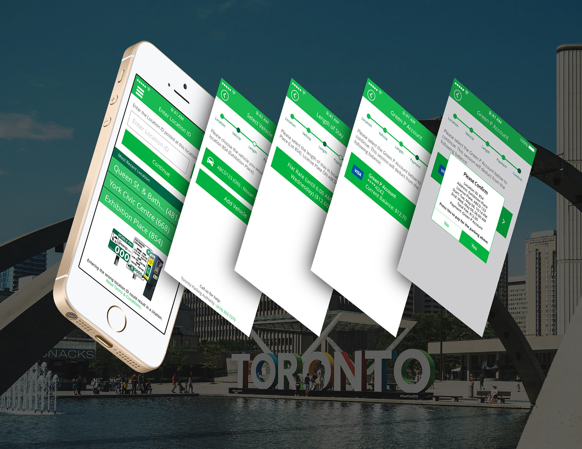
Current Task Flow
The app allows the user to save their vehicles and payment methods, as well as displaying their most recent parking locations. If the user is familiar with the app they can complete the process fairly quickly. However there is very little indication where the user is in the flow, or what each lot number means, forcing the user to click into each lot number, or remember what each one is.
The app allows the user to save their vehicles and payment methods, as well as displaying their most recent parking locations. If the user is familiar with the app they can complete the process fairly quickly. However there is very little indication where the user is in the flow, or what each lot number means, forcing the user to click into each lot number, or remember what each one is.

Current Task Flow
REDESIGNED Task Flow
The main focus for the redesigned flow was to better indicate where the user is in the process and presenting only the relevant information when it is appropriate. The app features an image of the posted signage and machines to direct users where they can find the lot number and hours of use. The recent locations have been updated to include street names to better orient the user and reduce the amount of steps needed to find this important information. Terms and conditions have been moved to a separate page, accessed through a clear link at the bottom of the app page. This information was overwhelming to users and only took up precious screen space. To better orient the user where they are in the booking process a checkout flow was added. The final change was to redesign the confirmation screen to better match the visual style of the app.
The main focus for the redesigned flow was to better indicate where the user is in the process and presenting only the relevant information when it is appropriate. The app features an image of the posted signage and machines to direct users where they can find the lot number and hours of use. The recent locations have been updated to include street names to better orient the user and reduce the amount of steps needed to find this important information. Terms and conditions have been moved to a separate page, accessed through a clear link at the bottom of the app page. This information was overwhelming to users and only took up precious screen space. To better orient the user where they are in the booking process a checkout flow was added. The final change was to redesign the confirmation screen to better match the visual style of the app.
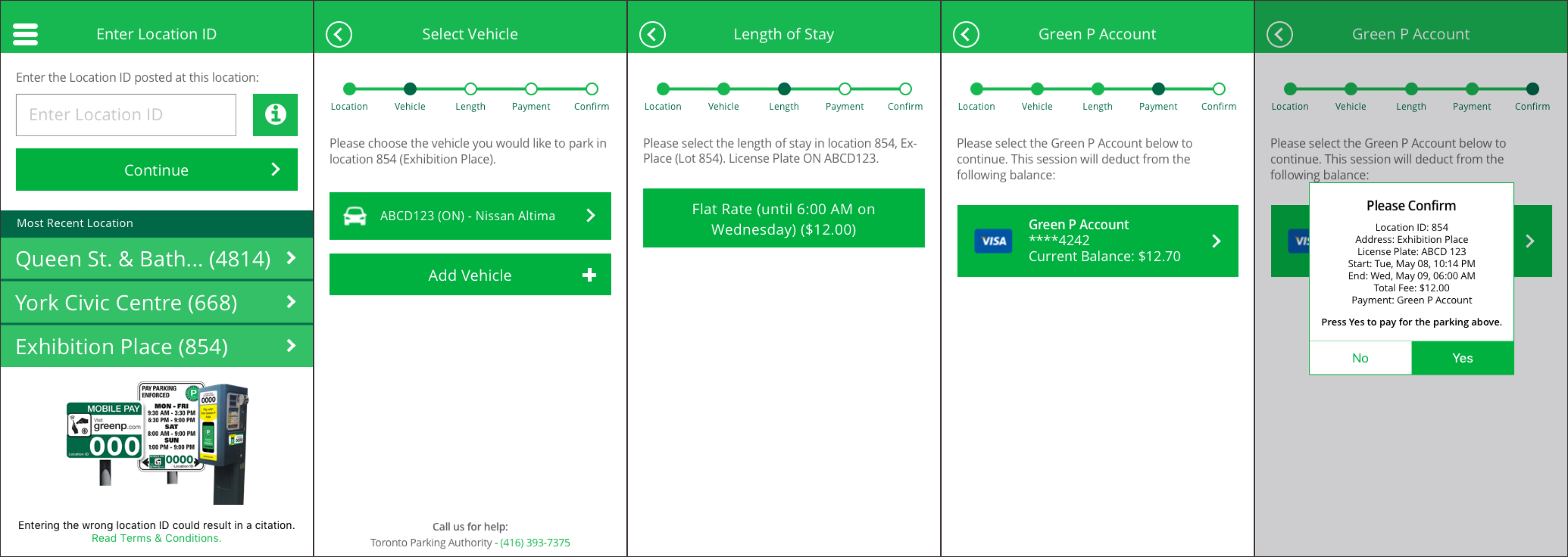
Redesigned Task Flow
Next Steps
Moving forward, it would be beneficial to look at the app once again after analyzing it against the remaining heuristics.
Previously focusing on the five most relevant heuristics allowed for a good MVP (minimum viable product). But by looking at the remaining five, we can uncover further insights, allowing for a stronger product.
Once the remaining heuristics have been completed, user testing will need to be conducted. We can gain further insight, validate our assumptions, discover better flows and approaches to user pain points. Following testing, iterations will need to be completed and user testing will need to be conducted once again. Further testing can be run, however at this point the app should be released to the public and real world tests can be run. Isolation can only yield a certain amount of results.
Comparing the website and the app, there is a disconnect with the visual style. The app looks outdated and could benefit from a redesign. An effort should be made to match the website, which in my opinion, looks more contemporary and is more visually pleasing.
Full Report
Persona photo from Photo by bruce mars from Pexels