
Genres span across multiple categories: TV, Movies, Music, Sports, & Lifestyle.
Following multiple rounds of research, competitor analysis and exploration, a new visual identity was developed.
Project Details
Timeline: 6 weeks
Deliverables: Competitor & Market Trends Report, Findings & Recommendations PowerPoint, Visual Exploration Documents, Tile Designs
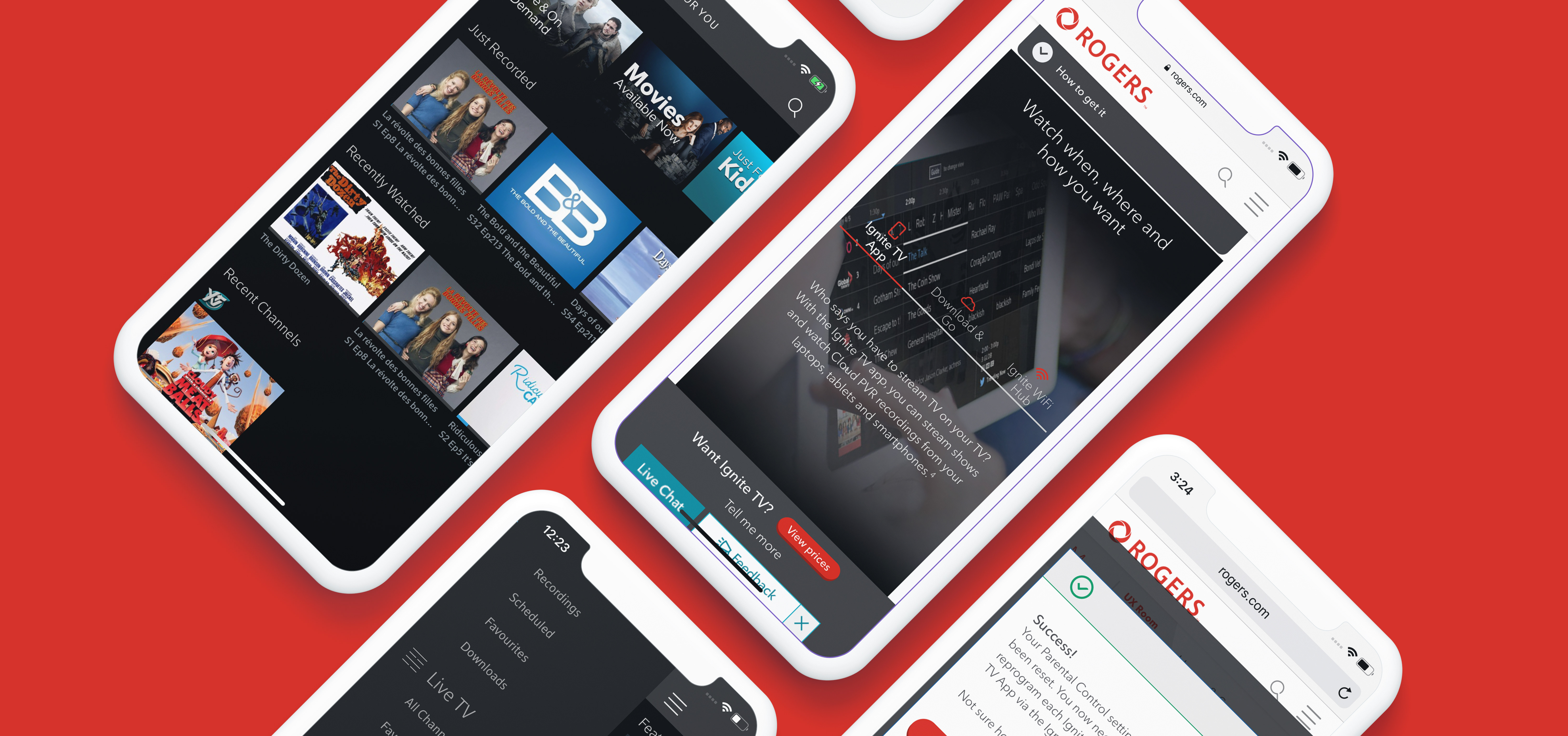
Tools: Ignite TV, Adobe Illustrator, PowerPoint
Project Phases: Competitor & Market Trends Analysis • Findings & Recommendations PowerPoint • Visual Exploration • Tile Creation
Team: Przemek Jalowski, Ron Perrault, Dennis Liwag
Deliverables: Competitor & Market Trends Report, Findings & Recommendations PowerPoint, Visual Exploration Documents, Tile Designs
Tools: Ignite TV, Adobe Illustrator, PowerPoint
Project Phases: Competitor & Market Trends Analysis • Findings & Recommendations PowerPoint • Visual Exploration • Tile Creation
Team: Przemek Jalowski, Ron Perrault, Dennis Liwag
Business Objectives
By creating a unified and high quality visual experience, users signing up for this premium product will get better value for their money, increasing sign up and reducing churn.
Helping a user navigate to a desired category quickly and finding relevant programs reduces the chance of them thinking, “there is nothing good here”, and dropping the service.
User Objectives
It was important to allow the user an easy way to navigate to their favourite shows.
In addition to voice search and featured tiles, users can search by genre as well. After scrolling through multiple rows of featured shows that may not catch the users interest, offering a general category like genres could help in the decision making process.
My Role
I was responsible for the first three quarters of the project from: competitor & market trends analysis to putting together a findings & recommendations PowerPoint, as well as the visual exploration. The project was then handed over to my colleague Dennis for tile creation and completion.
The Problem
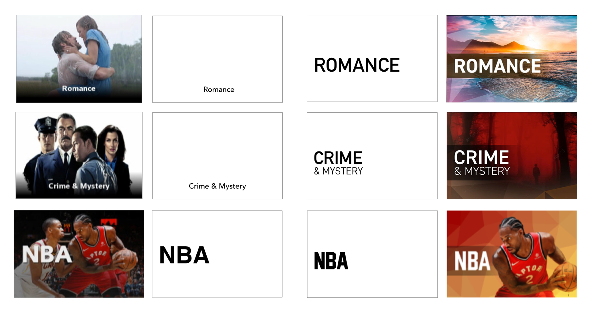
The genre tiles had a number of visual issues that made user experience difficult. The text was too small which made it hard to read, the images did not properly represent the category and they were not visually appealing. The lack of a unified visual system connecting the tiles to one another was troubling.
Instead of leading users to content they may be interested in, functioning as navigation near the top of the page, tiles were placed near the bottom as a last ditch effort to guide users to any content that may catch their interest.
Discover
RESEARCH
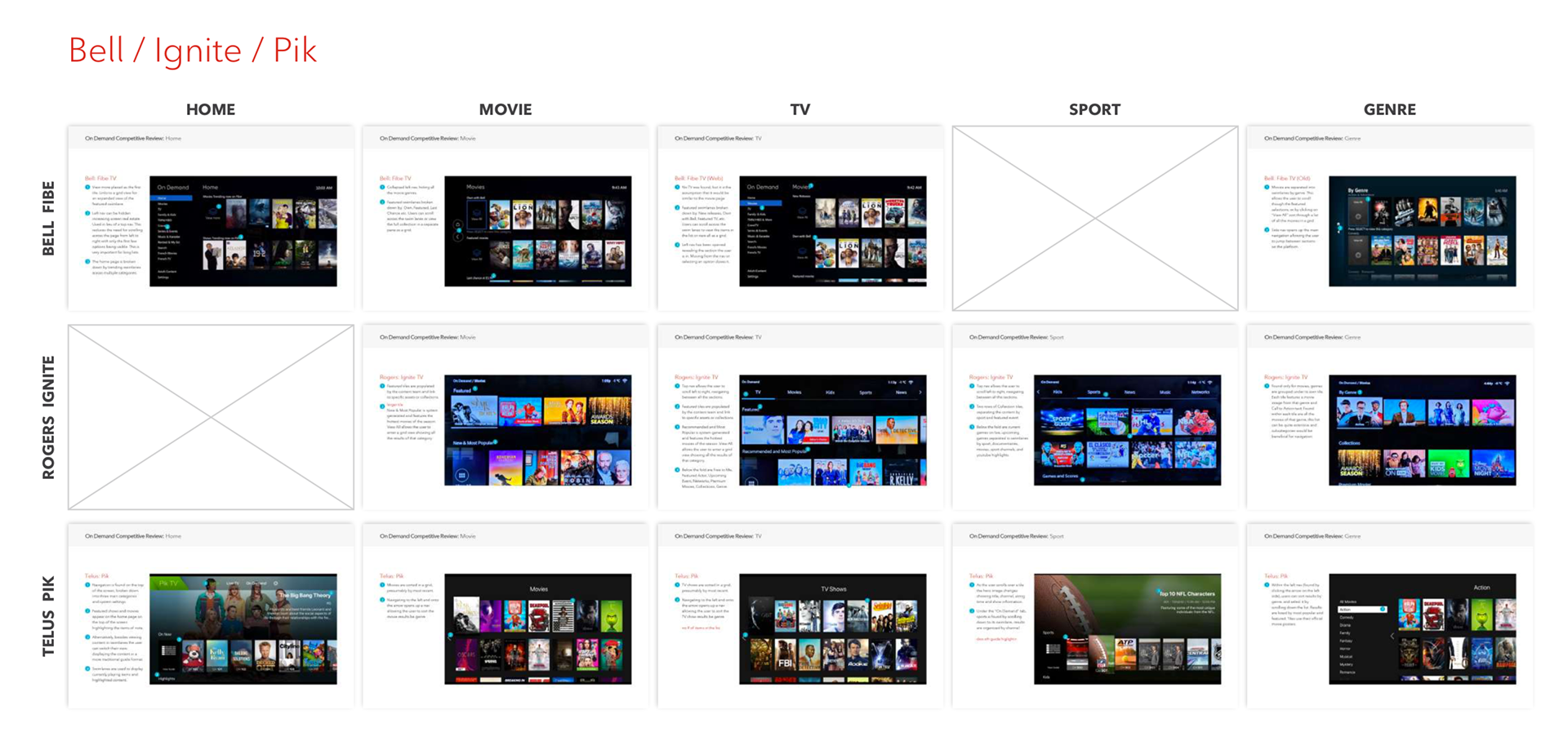
Research encompassed a variety of competitor content providers ranging from: telecommunication, video and music platforms (eg. Telus, Bell, Netflix, Amazon Prime, Youtube, etc.). Using screenshots, three specific types of content were analyzed in each platform: navigation, visual treatments and page structure. Based on these elements and market trends of competitors, the following six patterns and treatments were discovered:
1 Lists - A navigational list, normally found on the left side of the page. Content updates on scroll.
2 Swimlanes - Each genre is split into a lane, with the title on the top and movie/show posters creating the row.
3 Text Based - Tiles are a single colour and feature centred text.
4 Icon Based - Contents of the tile are conveyed with icons and symbols in addition to text.
5 Image Based - Tiles feature photography or illustration representing the content within.
6 Backgrounds - Tiles with text and a background composed of a pattern or representative image.
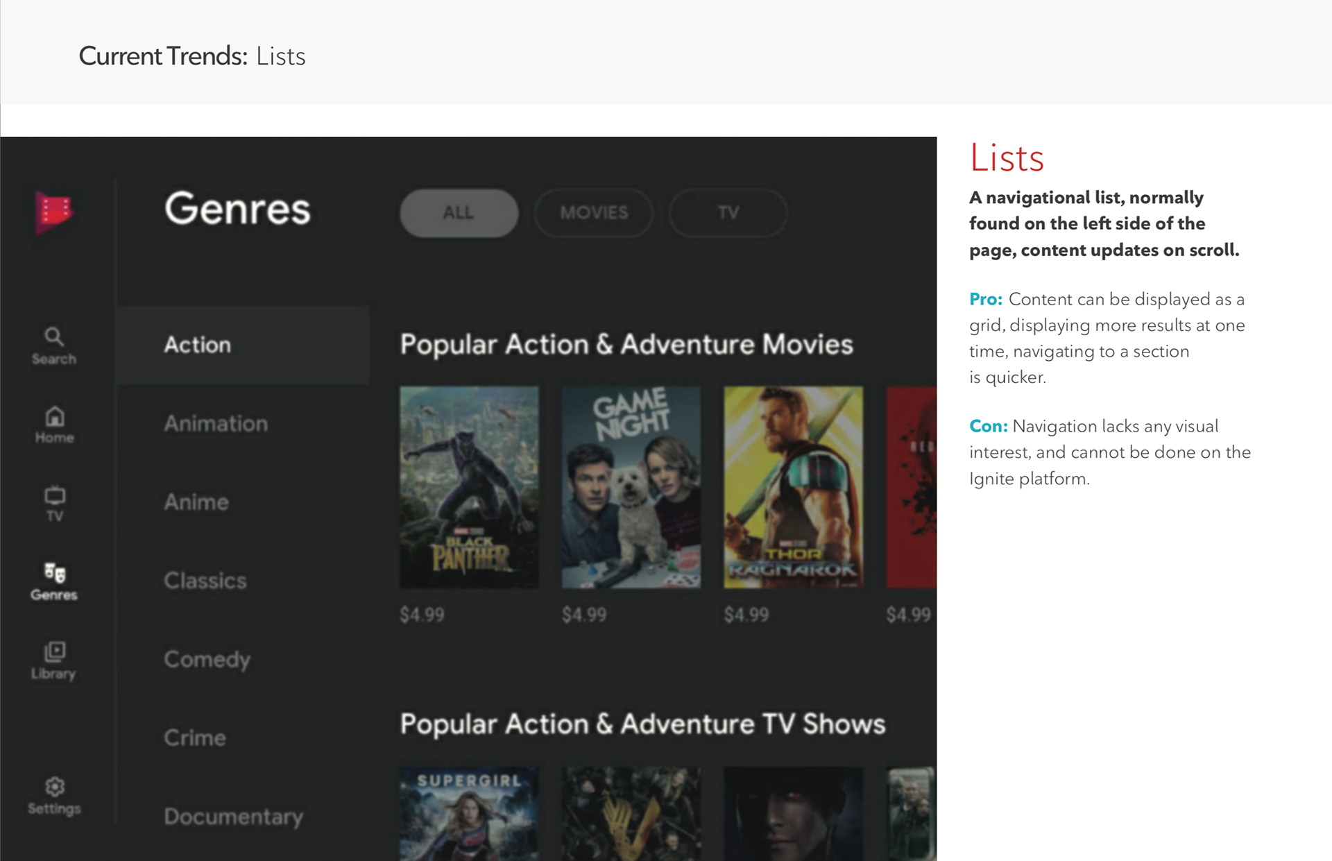
Current Trends: Lists

Current Trends: Swimlanes

Current Trends: Text Based

Genre Review: Icon Based
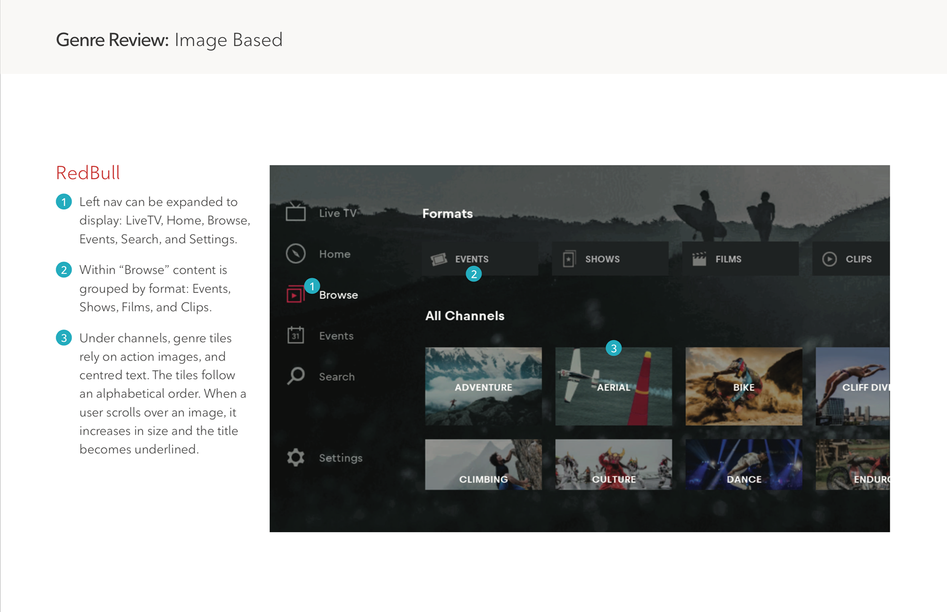
Genre Review: Image Based
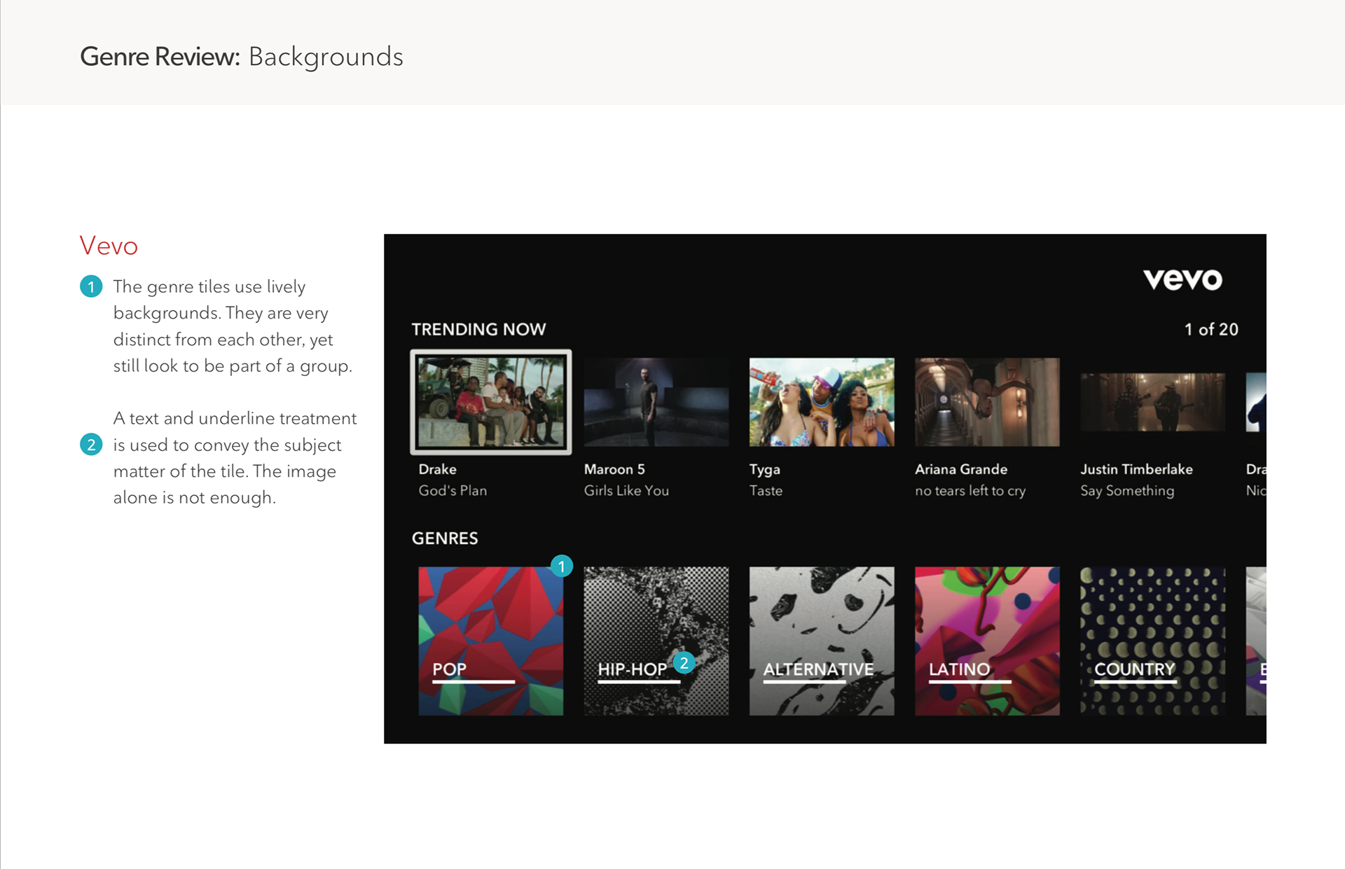
Genre Review: Backgrounds
RECCOMENDATIONS
After analyzing multiple platforms over various industries, common patterns of both successful and unsuccessful genre tiles led to the following considerations:
After analyzing multiple platforms over various industries, common patterns of both successful and unsuccessful genre tiles led to the following considerations:
1 - Use unobtrusive representative imagery to convey the tone of the contents within.
2 - Follow the same colour pallet and visual treatment for all the genre tiles, distinct from other page tiles & unique to each other.
3 - The text should be big, high contrast and easy to read, anchored to one spot consistently.
TV SPECIFIC CONSIDERATIONS
When designing for a screen of any size, considerations must be made. TV has unique challenges that are not seen on desktop or mobile.
When designing for a screen of any size, considerations must be made. TV has unique challenges that are not seen on desktop or mobile.
1 - The user is sitting 10 feet away from the screen, and what may be clear and well-saturated normally may be blown out or muddy from further away.
2 - Elements with ample space and proper hierarchy viewed on your phone may become cluttered and confusing, overwhelming the user with visual information.
3 - Consider where the tile may be placed, and beside which other elements. Most tiles are out of our control, avoid using competing colours, text styles and visual treatments.
4 - Consider colour. The Rogers brand predominantly uses red and white. On a TV screen red vibrates and whites can bleed, this is important to remember when adding text to a tile.

Ideate
Once the research was complete and a direction was chosen it was time to ideate, come up with concepts and test them.
STYLE EXPLORATION
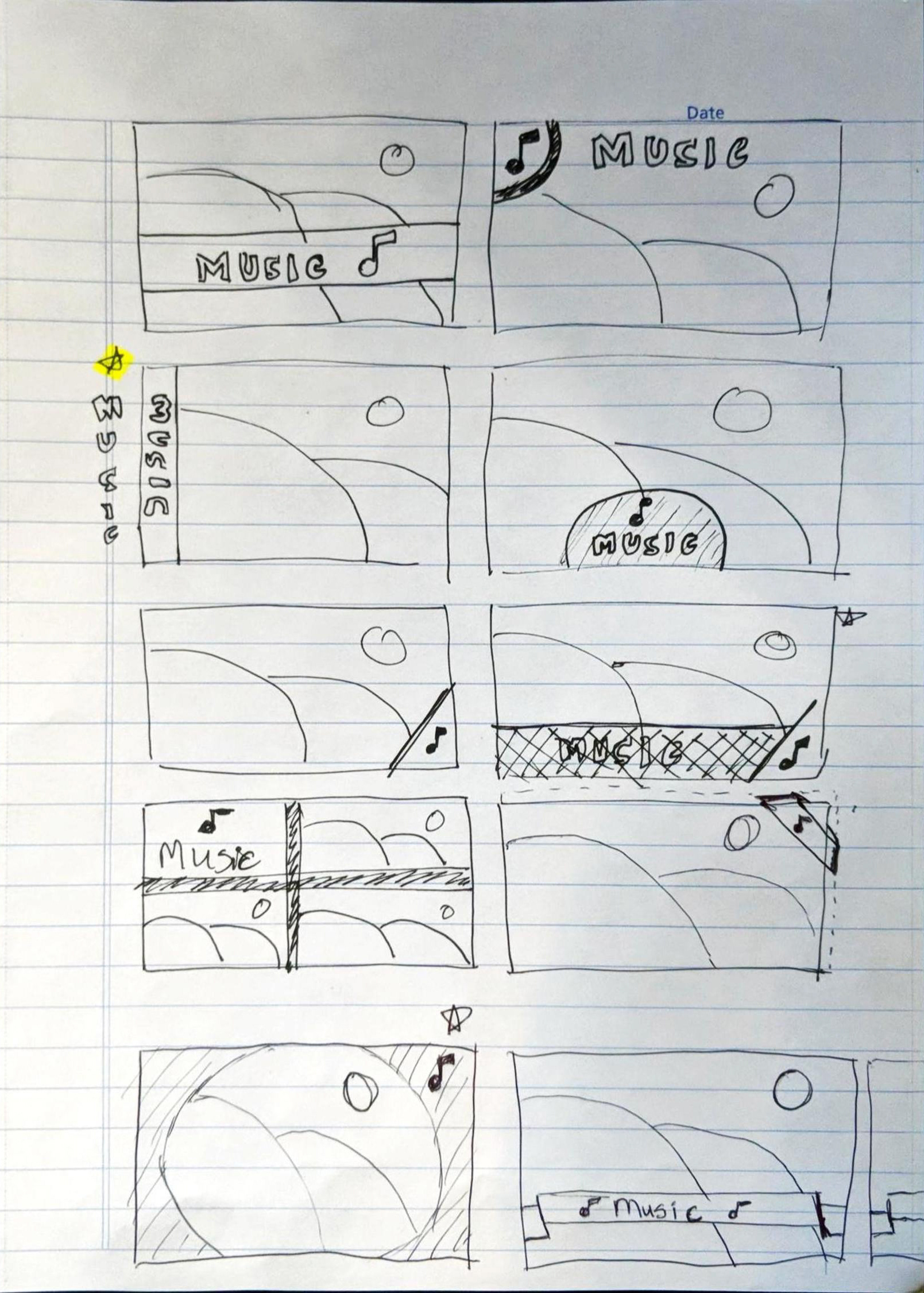
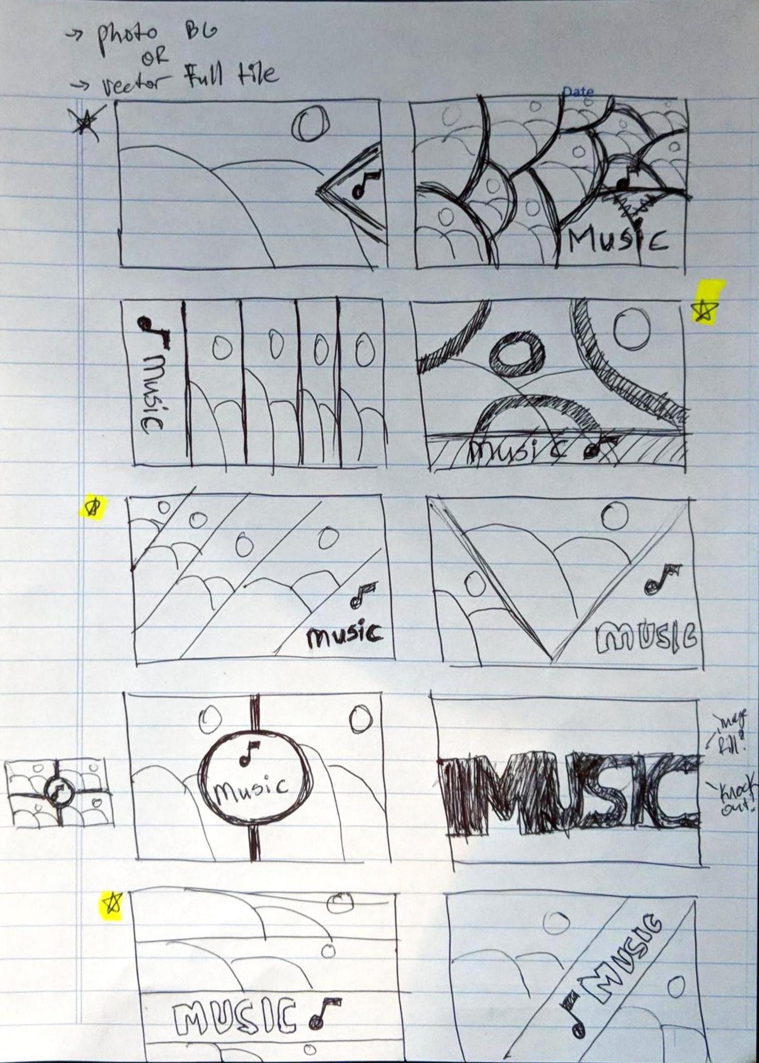
Using the lessons and insights discovered looking at market trends and the considerations outlined from the research, sketches were put together organizing all the appropriate ideas. During digital visual exploration, 50 initial ideas were reduced down to 15 and then finally three. Those final three styles were then combined to create the final look of the tiles.
Using the lessons and insights discovered looking at market trends and the considerations outlined from the research, sketches were put together organizing all the appropriate ideas. During digital visual exploration, 50 initial ideas were reduced down to 15 and then finally three. Those final three styles were then combined to create the final look of the tiles.
COMPLETING THE TILES
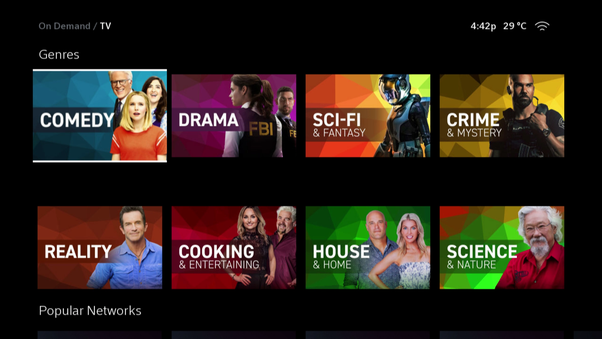
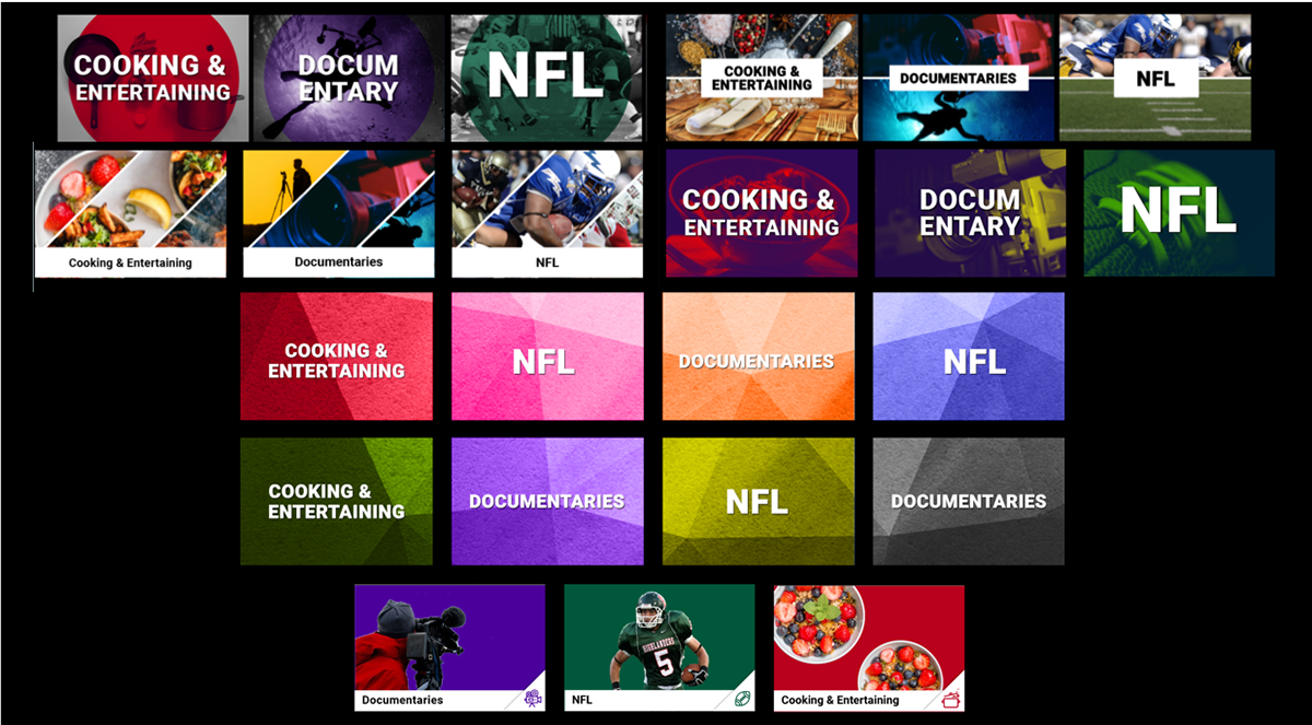
Each tile was broken down into 3 distinct elements: Big white text on a dark gradient banner, a striking clipped-out image, and a fractal background based on the category and image. The tiles are easy to read from 10 feet away, feature a clean layout, and all tie together creating a cohesive and recognizable visual style.
Each tile was broken down into 3 distinct elements: Big white text on a dark gradient banner, a striking clipped-out image, and a fractal background based on the category and image. The tiles are easy to read from 10 feet away, feature a clean layout, and all tie together creating a cohesive and recognizable visual style.
Outcome
After completing the genre tiles, the text is more readable, the images are striking, and they are distinct from the content around them. We are also able to place them higher on the page.
All these factors together has led to an increase of clicks, and subsequent program clicks by over 15%.

Next Steps
The next steps for this project is to carry this new style across the remaining platform tiles which we have control over. These tiles include: collection tiles, featured tiles, second screen tiles, promotional banners, and any tiles that need to be converted to french. The goal is to make this premium service look and feel premium instead of the stock format it followed before.